Apr 30, 2025
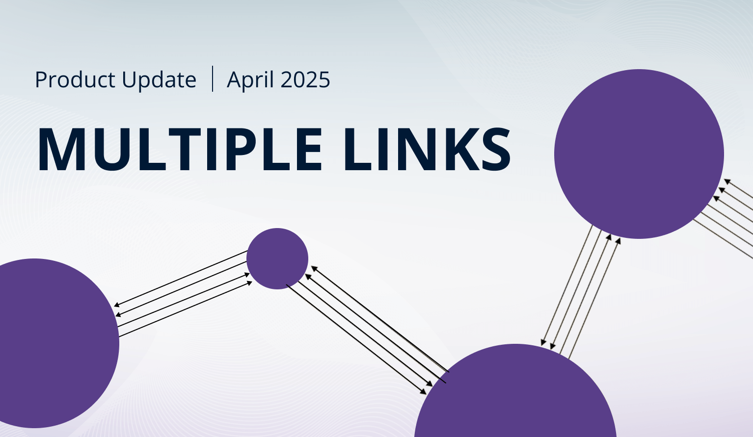
April 2025 Update: Multiple Links in Graph PRO & Total Labels for Stacks
Create multiple links between nodes in Graph, enable and customize value labels for stack totals in Combo & Timeline, and more – read about what’s new in ZoomCharts visuals in April!
Create multiple links between nodes in Graph, enable and customize value labels for stack totals in Combo & Timeline, and more – read about what’s new in ZoomCharts visuals in April!
Your visuals should update automatically from AppSource. If your visuals have not received the updates automatically, read this documentation article that explains the manual update process.
Combo, Combo Bar, Timeline: 'Total' Value Labels for Stacks
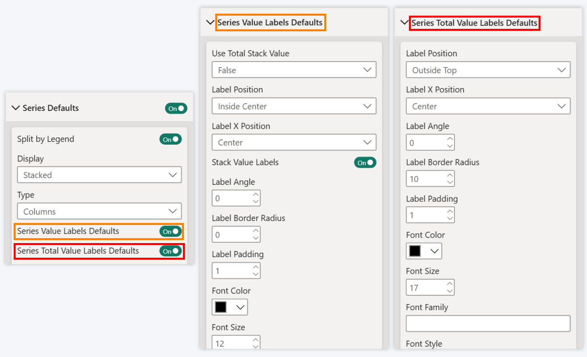
The April 2025 update for Combo, Combo Bar, and Timeline visuals will bring great news for report creators who like to build stacked charts. Now, you can enable and configure a Total value label which will display the cumulative value for the entire category or time unit.
When using Stacked display mode, you will now find the following toggles in the Series Defaults section:
- Series Value Labels Defaults: Enables value labels for all series or Legend segments. Once enabled, reveals Series Value Labels Defaults section where you can configure the default label appearance for all series or legend segment value labels.
- Series Total Value Labels Defaults: Enables Total value labels that will show the total stack value for the entire category or time unit. Once enabled, reveals Series Total Value Labels Defaults section where you can configure Totals value label appearance.
Of course, you can also apply series-specific settings – Series X Value Labels and Series X Total Value Labels - in the Series X Configuration section of the series you wish to configure. If enabled, they will take priority over Series Defaults.
This new feature will make it easier to configure the stack appearance. You can now easily apply separate customization settings to the Total value label to visually distinguish it from other labels – for example, make the font bigger, alter display units or value decimals, change position, or apply specific colors. This also means that if you want to declutter the chart and display just the Totals, you can enable them while disabling other value labels.
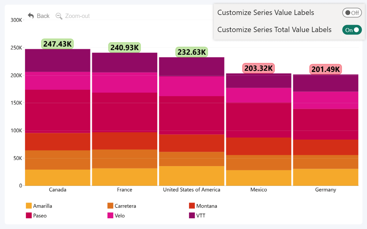
This will come in especially handy when using the Legend field to split series values into segments (read more about Legend field here). Previously, the value labels were all-or-nothing – either display the values for every segment, or none at all. Now, if you want to display just the total category or series value while hiding individual segment values, simply enable Totals while leaving the rest disabled.
- Documentation: Series Total Value Labels Defaults

 Drill Down Combo PRO
 Drill Down Combo Bar PRO
 Drill Down Timeline PRO
Timeline, TimeSeries: Show Decades as Major Units
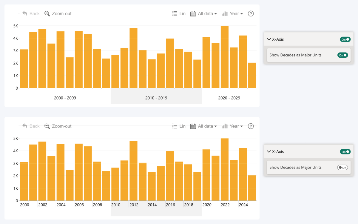
The April 2025 update for our two time-based visuals also introduces more control over the display units. By default, the visual will automatically combine each decade into a single axis unit if the view contains multiple decades (for example, “2010-2019”).
You can now disable this behavior using the Show Decades as Major Units toggle within X-Axis section, which will force the visual to display years as the major time axis units. If there is no space to fully display the label for each year, the visual may omit some labels (for example, by skipping every other year).
- Documentation: Show Decades as Major Units
- Drill Down Timeline PRO

 Drill Down TimeSeries PRO
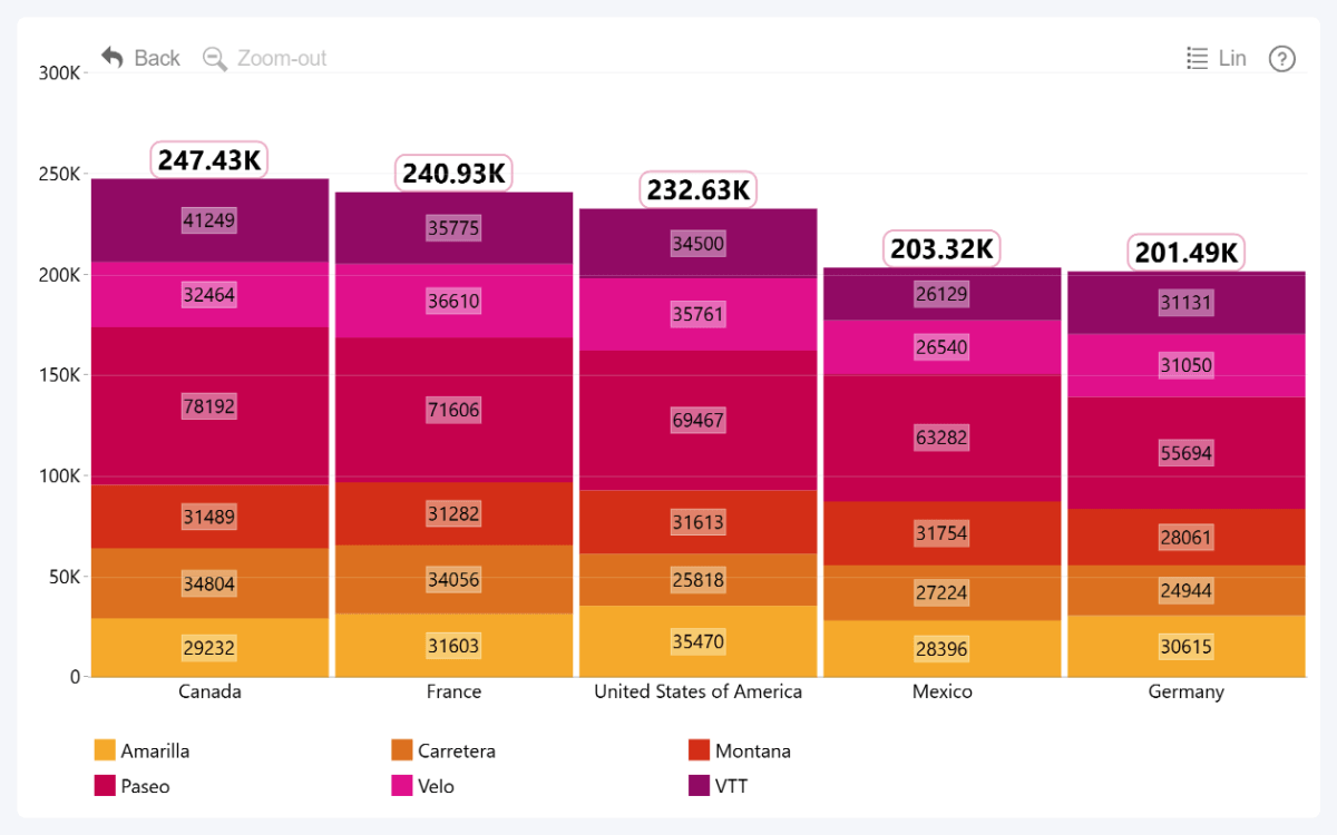
Graph: Multiple Links Between Nodes
The April 2025 update for Graph PRO introduces a new optional field – Link ID. Essentially, it allows you to provide unique IDs for each link you want to create, enabling you to connect multiple parallel links between a pair of nodes.
Without Link ID, Graph PRO will create links like before. Each relationship between Source and Target nodes will be represented as a single link. This means that a pair of nodes may have max two links – one in each direction.
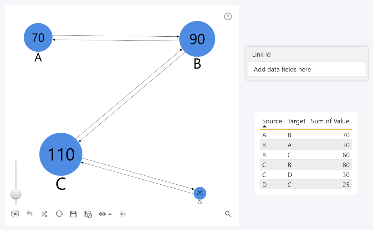
However, when using the new Link ID field, a separate link will be created for each row with a unique link ID string. For example, if there are three rows with the same Source and Target node IDs, but each row has a unique link ID, this means that the visual will display three parallel links.
Furthermore, the Link Color, Label, Category, and Width fields will affect each link separately – in this example, we also used the same Link ID column as the link label to better illustrate the effect.
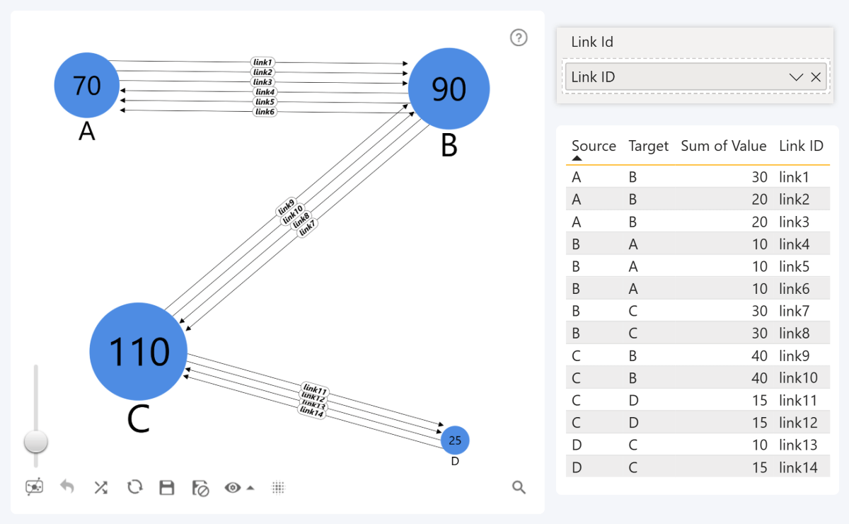
This will be useful in many different scenarios. For example, in supply chain management, each link may represent a unique shipment from one place to another. Alternatively, each money transaction between two parties can be visualized as a separate link.
- Documentation: Link ID field

 Drill Down Graph PRO
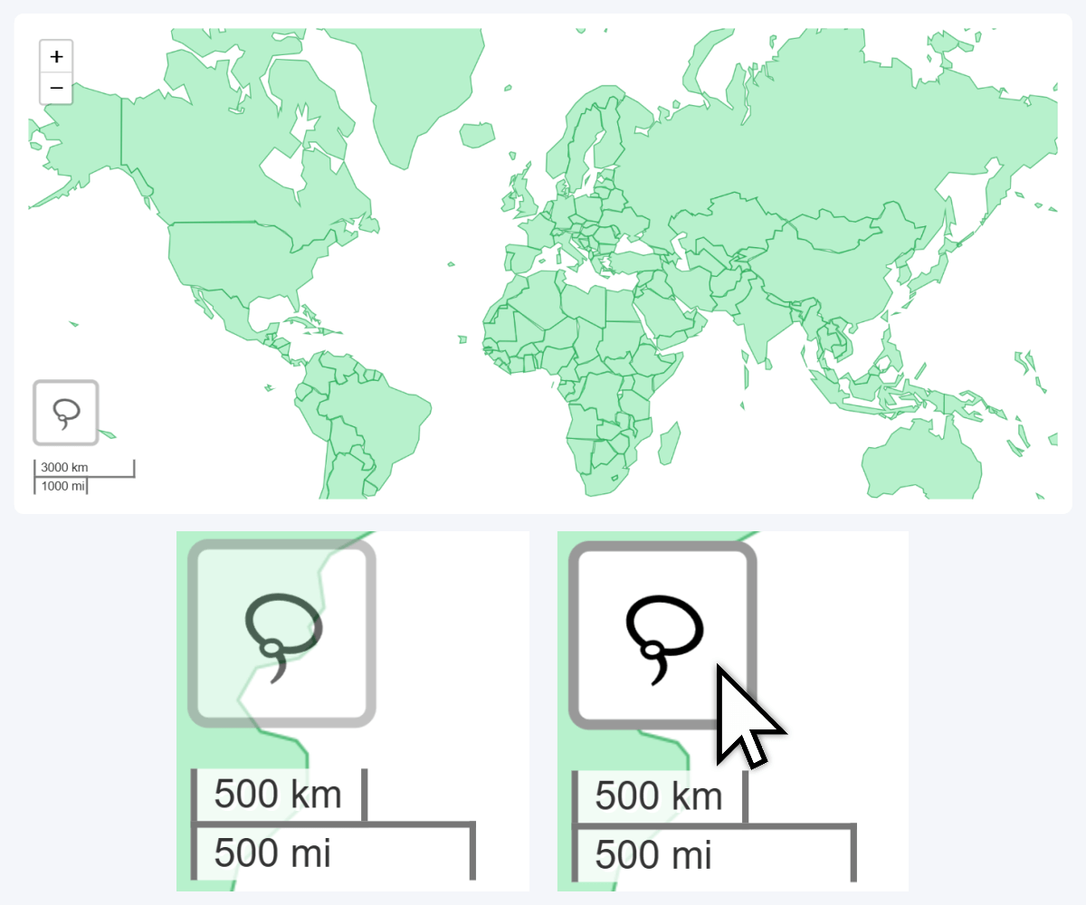
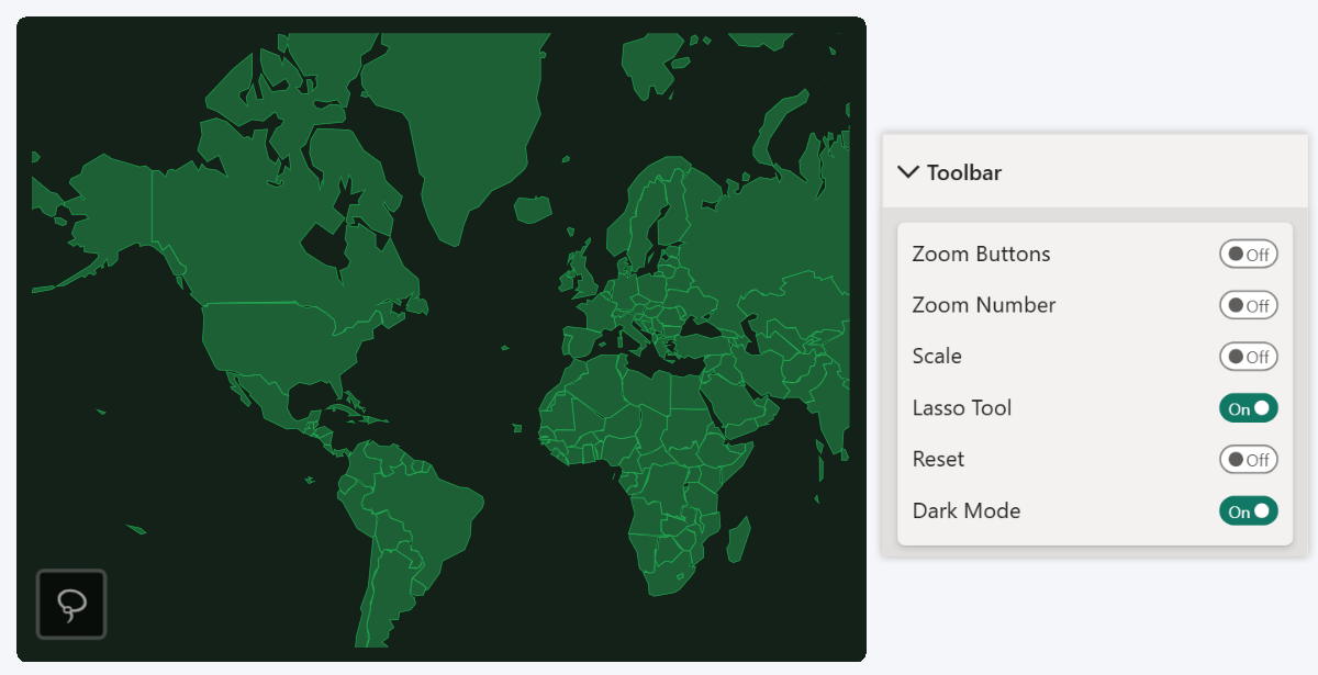
Map, Shape Map: Minor Style Tweaks to 'Lasso' Button
Lastly, we have slightly altered the Lasso toolbar button in our Map PRO and Shape Map PRO visuals by adding a semi-translucent background and a rectangular outline, which will ensure its visibility when navigating the chart. In addition, enabling Dark Mode in Toolbar settings will invert the Lasso button color to dark gray.
Like many other features, this change was suggested by one of our clients. If you wish to provide feedback about ZoomCharts products or suggest new features, you can get in touch with our team using this contact form. In addition, our Custom Visual Development Service is also available if you need a tailor-made visualization for your specific use case.
Get Started with ZoomCharts
Be sure to download the latest version of ZoomCharts Visuals to enjoy these new additions, along with hundreds of other features! With a free trial available, you can see for yourself how these powerful visuals can take your Power BI reports to the next level.
- Drill Down Combo PRO
- Drill Down Combo Bar PRO
- Drill Down Timeline PRO
- Drill Down TimeSeries PRO
- Drill Down Graph PRO
- Drill Down Map PRO & Shape Map PRO

Want more info like this?
Subscribe to our newsletter and be the first to read our latest articles and expert data visualization tips!