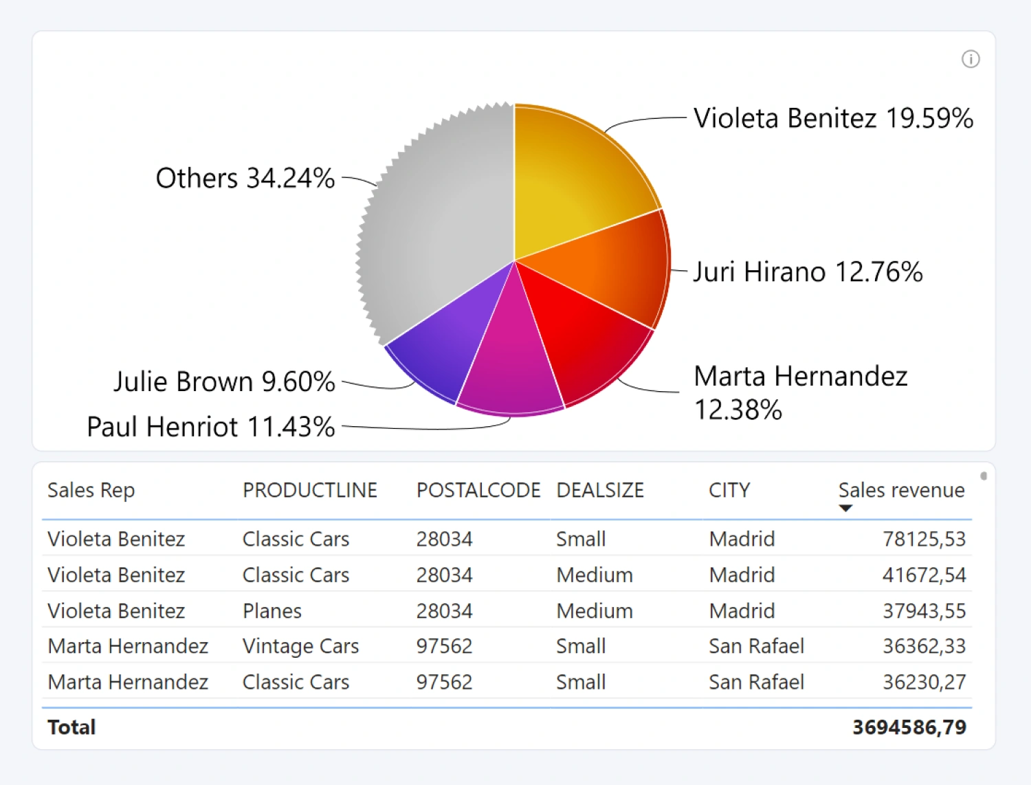
Drill Down Pie PRO is an exciting and user-friendly way to explore multi-level categorical data in depth and quickly find actionable insights.
Before you begin
This visual is designed for categorical data. Make sure that your data set has at least one column that contains categories, and another column with numerical values for each category.
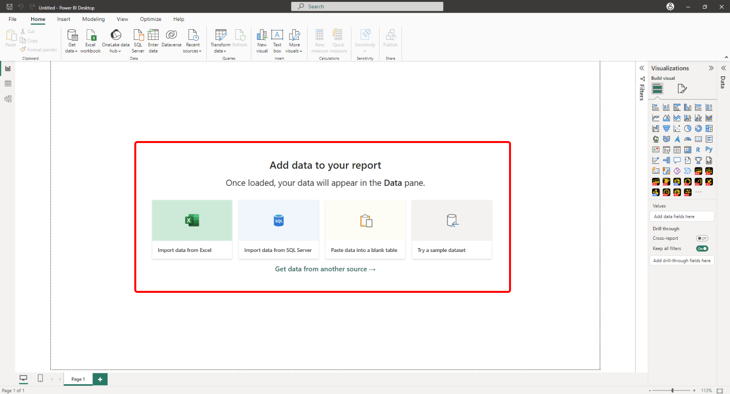
When you create a blank Power BI report, you will be presented with multiple options: you can import your own data, paste it into a blank table, or try a sample data set that’s provided by Power BI. The latter option is recommended if you want to experiment with the features of Drill Down Pie PRO without using your own data.
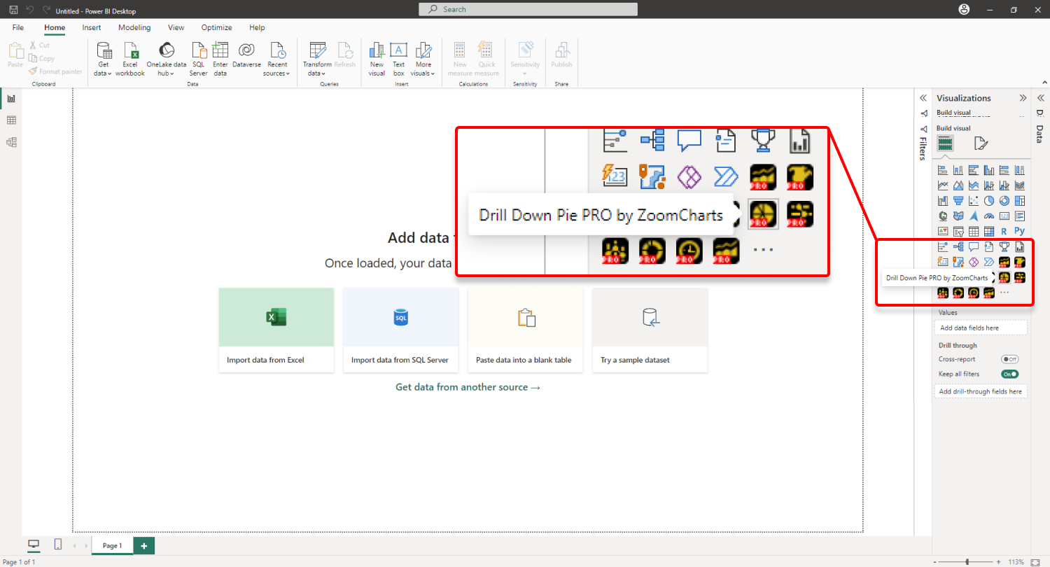
Adding Drill Down Pie PRO to Power BI
If you have downloaded this visual from Microsoft AppSource within Power BI Desktop, its icon should appear in the Visualizations pane on the right side of your Power BI window.
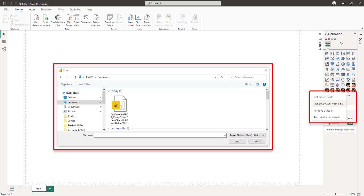
If you have purchased Drill Down Pie PRO externally, you may need to add it to Power BI manually. You can manually add the visual by clicking the ellipsis icon and pressing Import a visual from a file. Locate the .pbiviz file and the visual will be added to the Visualizations pane.
You need to have a valid license to use the PRO features of this visual. Read more about licensing on this page.
Creating a pie chart with Drill Down Pie PRO
To add Drill Down Pie PRO to your Power BI report, click on the visual’s icon in the Visualizations pane. Doing so will create a blank visual that contains no data. Drill Down Pie PRO requires two fields – Category and Values, and it will create a pie chart after valid data is added to both fields. You can read more about the required fields in this page, and about optional fields in this page.
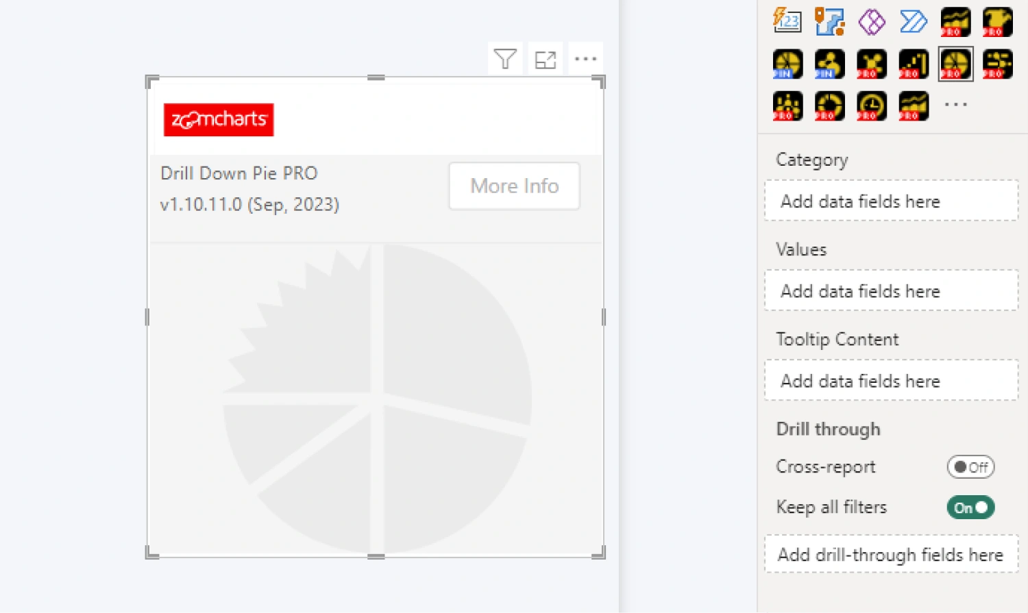 Category field is used to create the slices, whereas Values field assigns numerical values to each category to determine the slice sizes and values. Adding multiple columns to the Category field will create a drill down hierarchy. The hierarchy will be determined by the category order in the field. Once you have added the required data, Drill Down Pie PRO will instantly create a pie chart.
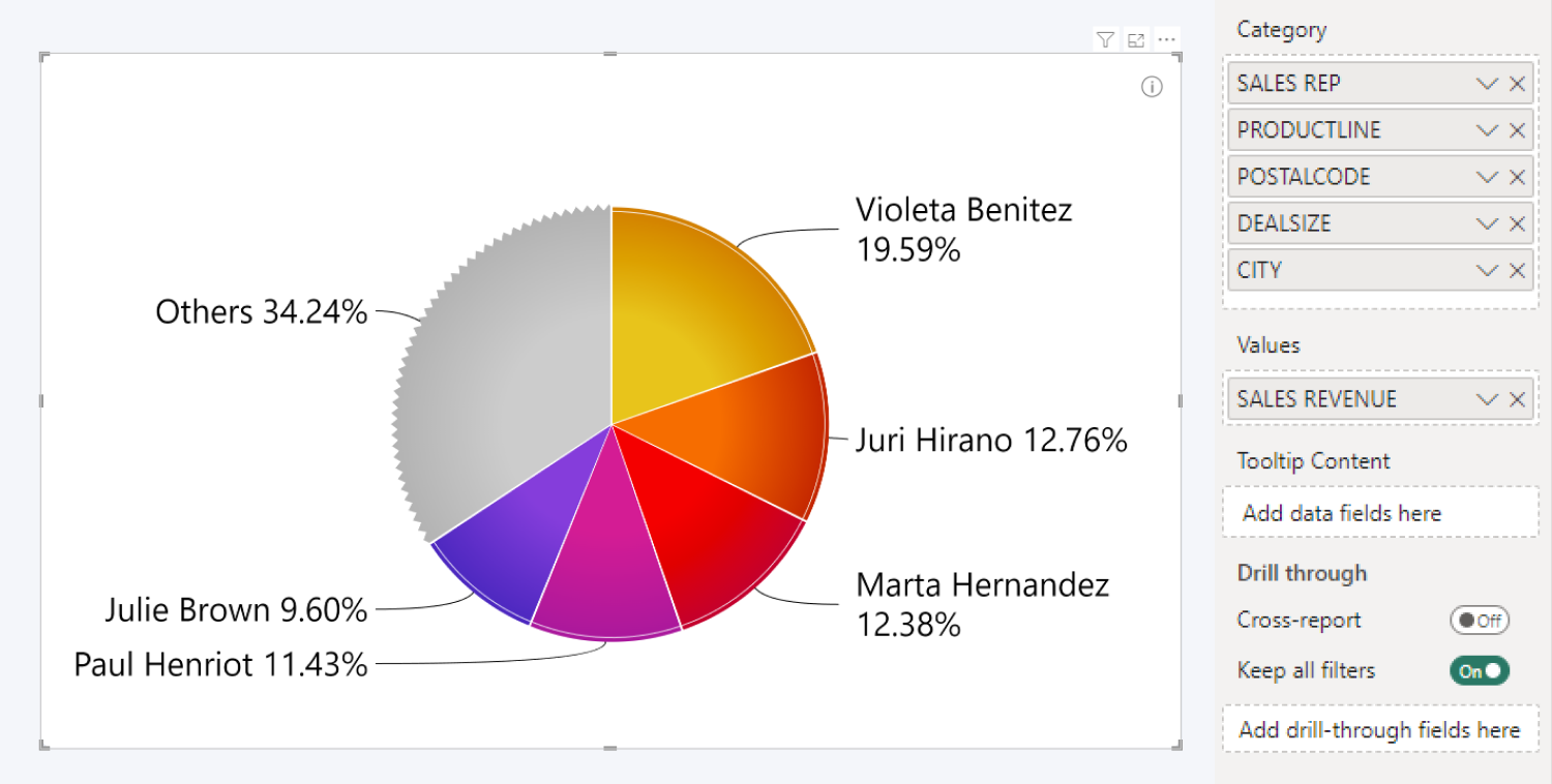
You have successfully created a pie visual with your data. You can now explore the Formatting Options tab to customize the look and behavior of your chart, including slice colors, legends, and labels. You can also enable and configure the Others slice to group smaller categories into one slice that can be expanded with a click; and enable cross-chart filtering to use your pie chart as an interactive filter for the entire report.
Was this helpful? Thank you for your feedback!
Sorry about that.
How can we improve it?