Nov 07, 2022
Using Power BI Conditional Formatting in ZoomCharts Drill Down Visuals
When you’re creating reports in Power BI, conditional formatting is one of the most powerful tools for data storytelling. Color is one of the main factors in visual salience, and you can use it to make your reports give a lot of information to the viewer with just a quick glance.
When you’re creating reports in Power BI, conditional formatting is one of the most powerful tools for data storytelling. Color is one of the main factors in visual salience, and you can use it to make your reports give a lot of information to the viewer with just a quick glance.
Color can call attention to certain data points and help your users quickly draw conclusions, which is why conditional formatting is a useful feature for Power BI data visualization. It will automatically select the colors, gradients or other formatting options for your data depending on your chosen criteria.
In this article, we will explain in detail what Power BI conditional formatting is, how to use it in ZoomCharts Drill Down Visuals, and how to best utilize it to enhance your data storytelling within your reports.
What is Power BI conditional formatting?
When you are building charts for your report in Power BI Desktop, you will have the ability to manually apply colors and gradients to specific data series or the entire chart. You can use these formatting options to make your chart look visually appealing or fit within your brand guidelines. However, some charts may benefit from the use of specific colors to tell a narrative. One such example would be highlighting series that exceed your KPI in green, but those below it in red.
Doing this manually will get tedious, as you will have to go into the settings for each column or bar and pick a color every time. That’s where Power BI conditional formatting comes in. It’s a feature that automatically applies certain formatting rules in accordance with predefined conditions, such as percentage or numerical value.
Use cases for Power BI conditional formatting
There are many ways you can use Power BI conditional formatting to make your data more salient and readable at a glance. In ZoomCharts Drill Down Visuals, conditional formatting will automatically adjust the formatting based on a numerical value. Here are some of our ideas on how to use this convenient feature.
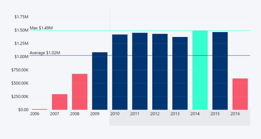
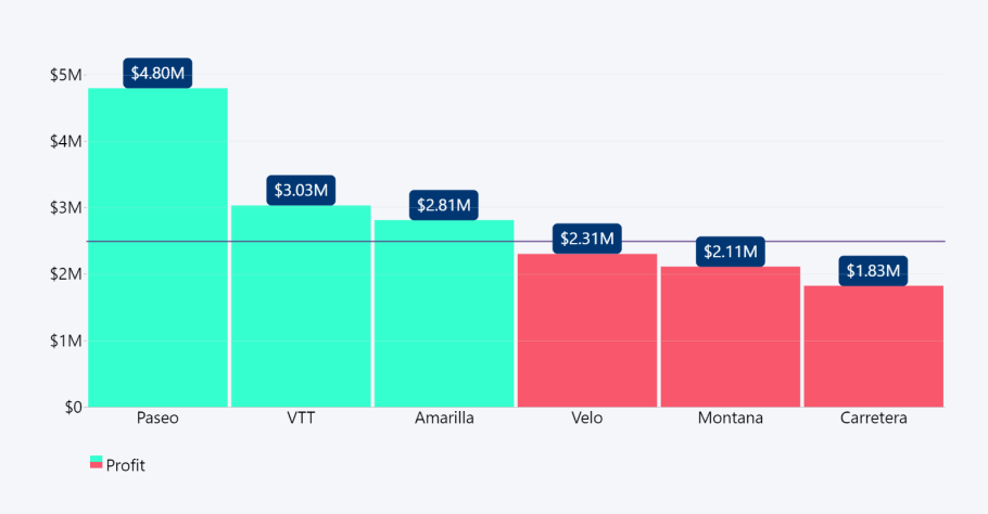
Use case #1 – Financial analysis
When creating a financial report, you can use conditional formatting to clearly display how your results stack up against your forecasts or expectations. This feature will come in handy whether you’re creating a timeline of your financial results or a budget breakdown. Conditional formatting will bring attention to underperforming financial quarters, or, conversely, call attention to your successes.
Use case #2 – KPI tracking
Whether you’re measuring the results of your marketing campaign, production output of your factories or staff productivity, there will always be some key performance indicators you can compare them against.
Set the expected amount of sales conversions, social media engagements, website visits or manufactured units as the middle point, and enable conditional formatting to automatically highlight the data series that fall below that line in a distinctive color.
Use case #3 – Benchmarking
When developing or maintaining software or hardware products, it’s important to benchmark and analyze the performance and compare it against your targets. For example, if your team is developing a new software algorithm and you need to create a chart for your benchmark results, you can set the desired performance scores as the middle point.
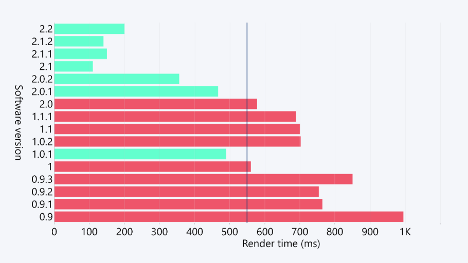
With conditional formatting, the visual will automatically select the colors for each column or bar according to their score. That way, you can quickly see the status of the project and the progress made by your team.
Use case #4 – Thermal analysis
Most people subconsciously associate color red with warmth and blue with cold. So, when you’re creating a bar or column chart that includes temperature data, it’s handy when the visual can appropriately format by rules depending on the degree value.
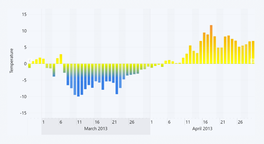
Whether you’re creating detailed weather reports or monitoring the thermal efficiency of your products or equipment, you can use Power BI conditional formatting to color-code your temperature timeline chart. What’s more, you can use stepped colors or gradients to display the intensity of heat or cold.
If you’re working with weather data, temperature is not the only measurement that will benefit from conditional formatting. You can also use it to format your precipitation, humidity and other weather data charts in a similar fashion.
How to use Power BI conditional formatting in ZoomCharts Drill Down Visuals?
Conditional formatting is a feature that has been recently introduced to Drill Down Combo PRO, Combo Bar PRO, Timeline PRO and TimeSeries PRO visuals. After you’ve created your chart, you can then adjust formatting settings and enable the conditional formatting feature. Here’s how to do it.
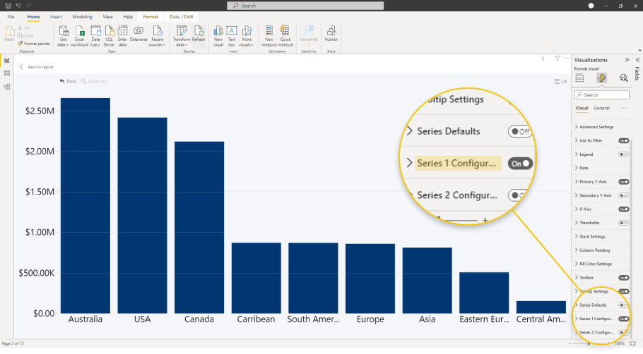
Step 1: Open the formatting settings
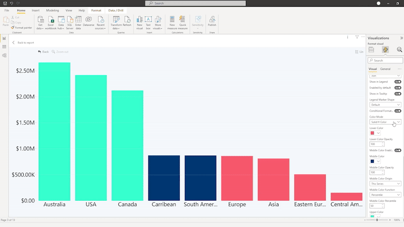
Click on the chart you want to customize, and the visualizations pane will reveal more options. You can find all the formatting options under the Format your visual tab. You’ll see a wide range of options, but to adjust the conditional formatting settings, you’ll need to scroll down and find Series X Configuration. Each of the series on your chart will have its own menu, so choose the one you want to adjust.
Step 2: Apply Power BI conditional formatting
In the individual series customization menu, you can find the toggle for conditional formatting. Click on it to enable this feature, and a new set of options will be revealed. First off, you will have to choose the color origin points. They are the points around which the formatting conditions will be adjusted. You can adjust the upper, middle (optional), and bottom color origins separately.
Selecting This series will give you the choice to use average, smallest value, or percentile as the color origin. You can also manually enter a value by choosing Constant Value or reference it from Another series.

Step 3: Adjust the formatting
Now that we’ve verified that the conditional formatting is enabled and it’s configured properly, we can move on to the fun part – customization! You can choose between four coloring modes.
- Solid H color: conditional formatting will be applied to the entire category if the criteria is met.
- Solid V color: conditional formatting will be applied only to the part of the column, area, or line that exceeds the threshold.
- Stepped color: the minimum and maximum values of the series (+ optionally middle point) will use the defined colors, but anything in between will use a color scale.
- Gradient: the color origin points will form a linear gradient across the entire series.
Keep in mind that Solid H color and Solid V color modes will behave the opposite way in Drill Down Combo Bar PRO, since the series will be displayed starting from the Y axis.
Conclusion
Conditional formatting was a highly requested feature among our users, and we’ve implemented it in Drill Down Combo PRO, Combo Bar PRO, Timeline PRO and TimeSeries PRO visuals. We’ve provided some examples of how to use this handy feature in your reports, but it’s up to you and your creativity to explore its full power!

Want more info like this?
Subscribe to our newsletter and be the first to read our latest articles and expert data visualization tips!