Sep 07, 2022
Top 5 Best Power BI Report Design Practices
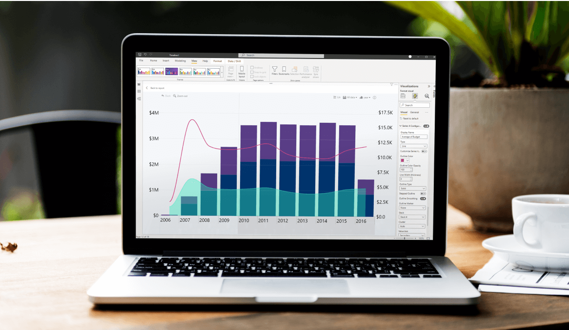
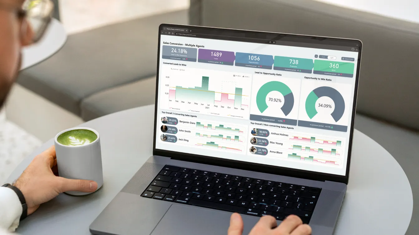
First impressions matter, even when you're creating Power BI reports. When your users open your report for the first time, they need to be presented with good-looking visuals that present data in an easy-to-read way, otherwise they'll leave confused and with more questions than before.

First impressions matter, even when you're creating Power BI reports. When your users open your report for the first time, they need to be presented with good-looking visuals that present data in an easy-to-read way, otherwise they'll leave confused and with more questions than before.
Why user-friendly Power BI report design matters
We all strive for style in a substance-filled report. There are endlessly cool options for making a report or dashboard, but these should not be done at the (often unintentional) expense of user-friendliness.
Power BI is constantly changing and adding new visuals and layouts, and as wonderful as these updates are, they can often confuse the user, thus making your report inefficient. Common problems users describe when reading a report include:
-
Unintuitive layout and navigation.
-
The report is too busy overall.
-
Viewers have trouble interacting with the report.
Nobody wants to make an inefficient report on purpose, but it can be difficult to find the perfect balance between functionality and style to make your viewers happy.
Power BI Report Design Tip #1: Layouts
First, look at publicly available resources such as Power BI Tips for inspiration.
Designing a compelling layout for your Power BI report can be difficult, especially if you’re not necessarily the most artistic person. Whether it’s paid or freely available resources, make sure to look for ideas and find a layout that works for what you’re trying to achieve.
When it comes to actually building your layout, there are multiple ways you can go about this.
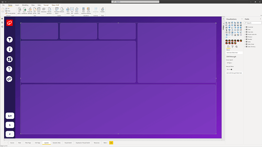
The most obvious solution: building shapes within Power BI itself
The most obvious one is to just build on the fly within the Power BI platform itself. The pros are that it’s easy, fast, and you just mix and match on the go. The cons are that your shapes will be recognized as elements. This means – clickability. If you lack quite a precise click, you could accidentally mess up your layout, for example, by accidentally making your shape go in front of your visual.
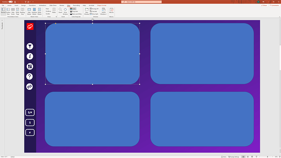
A layout built with PowerPoint shapes on top of a Power BI base
Another way is to use PowerPoint. Yes, you read that right – PowerPoint. PowerPoint offers more shapes than Power BI, so you get more variety. Simply build a layout on a PowerPoint slide, save it as a picture, and use that as your bottom layer in Power BI. Granted, any image you input into Power BI will come with a border. You may not be able to see it, but there will be some additional padding.
Power BI Report Design Tip #2: Navigation

Default in-built navigation menu on the left-side of Power BI
Remember this now and forever – make your report easy to navigate or your user will naturally transition to something else. You don’t want to put in all that effort into making a report only for it to end up getting shelved.
If your user doesn’t find it easy to navigate within your report, they’re likely to just revert to old methods such as Excel. So, prioritize making reports that will actually end up being used.
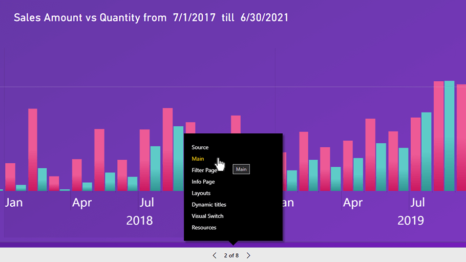
Pop-up navigation menu at the bottom of an embedded report
Consider on what device or platform your user will be viewing your report – is it more likely to be viewed on desktop, mobile or embedded devices? What would work for each user?
Once you figure that out, look for which elements can be used for navigation. Are the navigation buttons on the side? Is there a pop-up that allows the user to switch between each page? Ask your users how are they most likely to use your report.
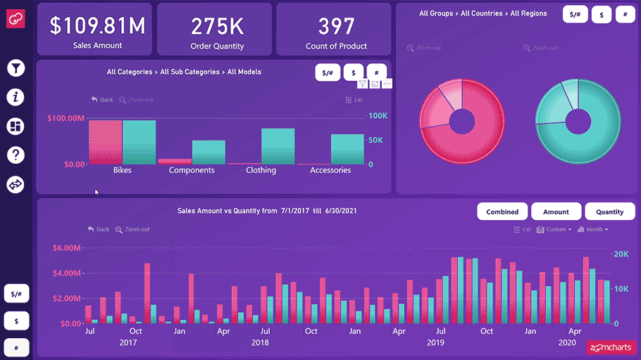
Power BI Report Design Tip #3: Visual switches
Visual switches aren’t necessarily a common practice. But the extra effort in implementing them and making a visual switch for every visual type is worth it.
They are a great way to allow the user more flexibility by changing and switching between views. They’re a great way to encourage extra insights for the user when reading a report.

Individual visual switches grant more flexibility by letting the user pick an individual view that they want to be able to see
Visual switches also raise performance, as you only end up having to refresh the data for the visual, rather than switching pages and refreshing all page elements.
Power BI Report Design Tip #4: Help sections
This practice may seem very on the nose, but when you’re preparing a report for users of varying Power BI skill levels, it helps to make some things super obvious.
Help sections and overlays can play a valuable part in explaining to the user what they’re looking at, what do certain buttons or elements do, etc.
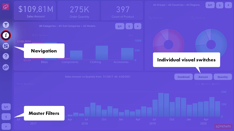
Example of a help overlay for your report
If you choose to make an overlay of separate help sections, focus on explaining what is going to be relevant to the end-user – navigation, master filters, visual switches, drill down options, and more.
Power BI Report Design Tip #5. Dynamic visual titles with card visuals
Instead of sticking with static titles, you can use card visuals as dynamic title systems, thus allowing your user more flexibility, and they can be implemented with any type of chart.
Example of dynamic titles at work
Why would you do this? For starters, they help the user keep track of what page or level they’re showing. Nobody risks getting confused and clicking back and forth to take note of what the presenter selected.
If you make sure to create a corresponding title with card visuals for each category, sub-level, date, and other various selections, your user doesn’t risk getting lost, and so the report immediately becomes more intuitive.
Conclusion
So, these were the top 5 Power BI report design best practices in a nutshell. Following these guidelines will guarantee you more intuitive and user-friendly reports.

Want more info like this?
Subscribe to our newsletter and be the first to read our latest articles and expert data visualization tips!