This release is focused on refinements that remove friction from everyday report-building. No large new features this time, just three targeted improvements that address real readability and customization gaps our users have been asking about.
Here is what is new:
- Smarter threshold label positioning for the Waterfall PRO visual
- An additional label format option for change threshold labels
- Series total tooltip customization for Timeline PRO, TimeSeries PRO, Combo Bar PRO, Combo PRO, and Line PRO
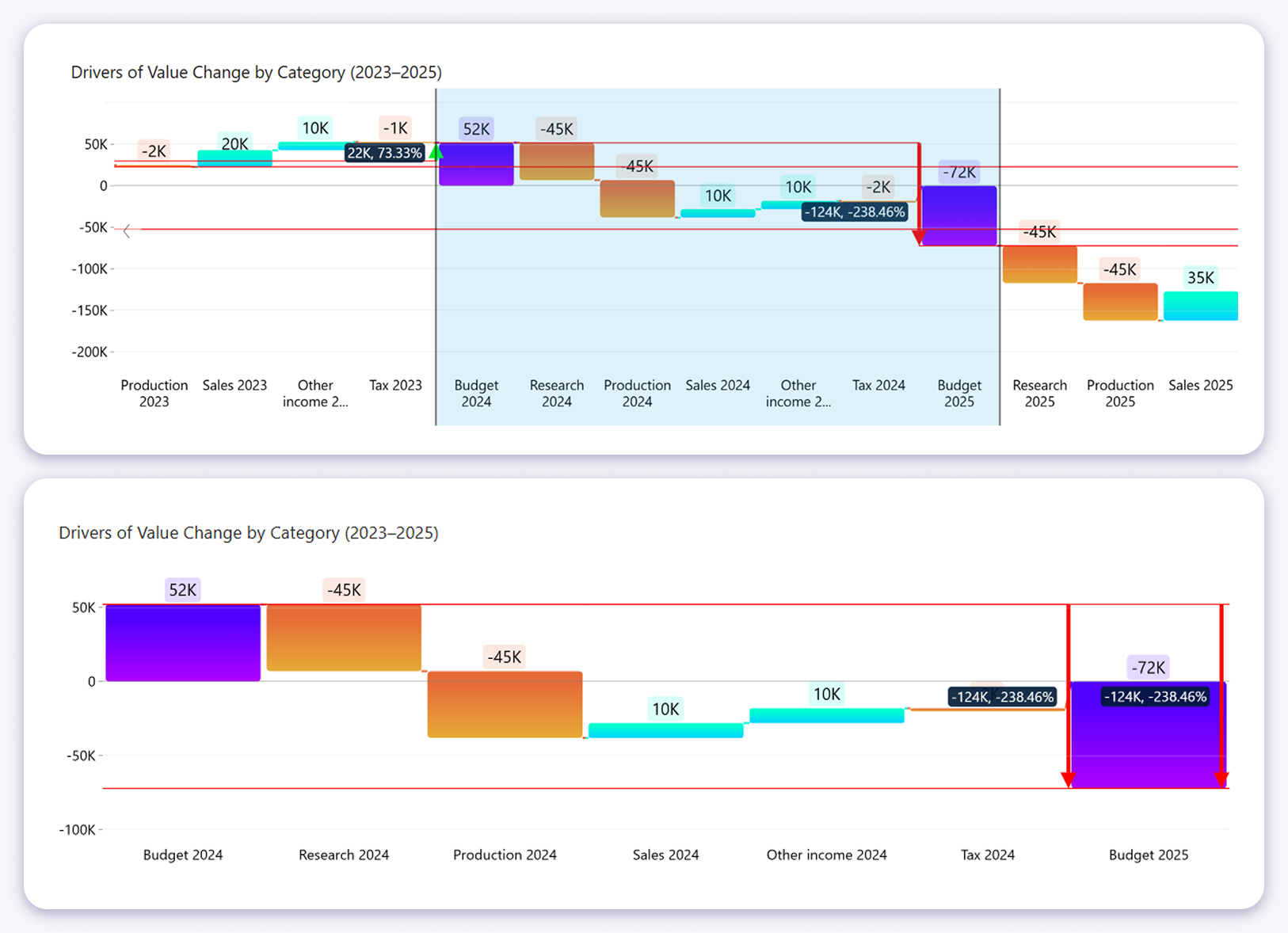
Waterfall PRO: Smarter Threshold Label Positioning
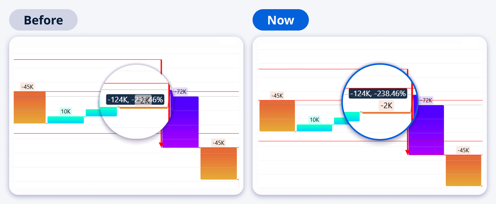
When a change threshold label and a category value label occupy the same space, the result is a cluttered, hard-to-read chart. Previously there was no way to control this. Labels simply overlapped. This release fixes that with a new default behavior and a dedicated setting to give you full control.
New default behavior: when a change threshold label would overlap with a category value label, the threshold label is now automatically repositioned above or below to avoid the conflict. No configuration needed. It works out of the box.
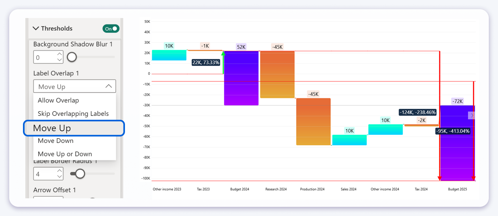
Label Overlap setting
For cases where you want explicit control, a new Label Overlap setting is available under Threshold Settings. The available options are:
- Allow Overlap: threshold and category labels may overlap (previous behavior)
- Skip Overlapping Labels: threshold labels are hidden when overlap would occur
- Move Up: threshold labels are always positioned above category value labels
- Move Down: threshold labels are always positioned below category value labels
- Move Up or Down: threshold labels are automatically repositioned to avoid overlap (the new default)
Waterfall PRO: Additional Label Format for Change Threshold Labels
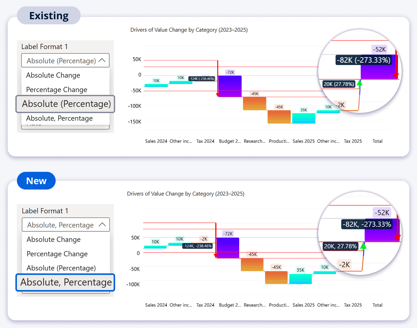
The change threshold label in Waterfall PRO previously offered three format options: Absolute Change, Percentage Change, and Absolute (Percentage), where the percentage was always wrapped in parentheses. Some reporting standards always display negative values in brackets, but others do not use brackets at all. The parentheses format was forced on everyone.
This release adds a fourth format option: Absolute, Percentage: the absolute change and the percentage are separated by a comma rather than brackets. This aligns with reporting standards that treat parentheses as a negative number notation and prefer a clean comma-separated format instead.
Available Label Format options
The Label Format setting is available when the Threshold Type is set to Change and the Label Type is set to Value or Text, Value. The four options are:
| Format option | Example output (from $50 to $30) |
|---|---|
| Absolute Change | -$20 |
| Percentage Change | -40% |
| Absolute (Percentage) | -$20 (-40%) |
| Absolute, Percentage New | -$20, -40% |
Selecting Percentage Change or Absolute (Percentage) or Absolute, Percentage reveals an additional Percentage Change Calculation setting for further control over how the percentage is computed.
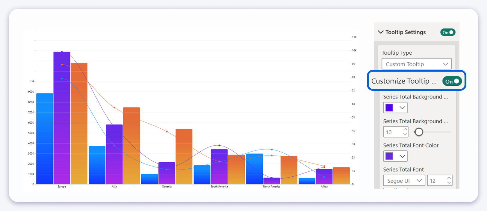
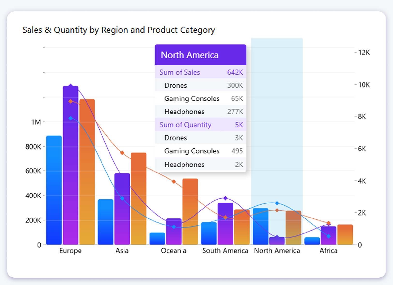
Series Total Tooltip Customization
When a Legend field is used in a chart visual, the tooltip displays a Series Total row showing the aggregated value across all sub-series for the hovered category. Previously, this row inherited the general tooltip styling with no way to distinguish it visually from the individual series rows below it.
This release adds a dedicated settings group for the Series Total row, giving you independent control over its background color, opacity, font color, font family, font style, and font size. This allows the total row to be made visually distinct from the breakdown rows beneath it.
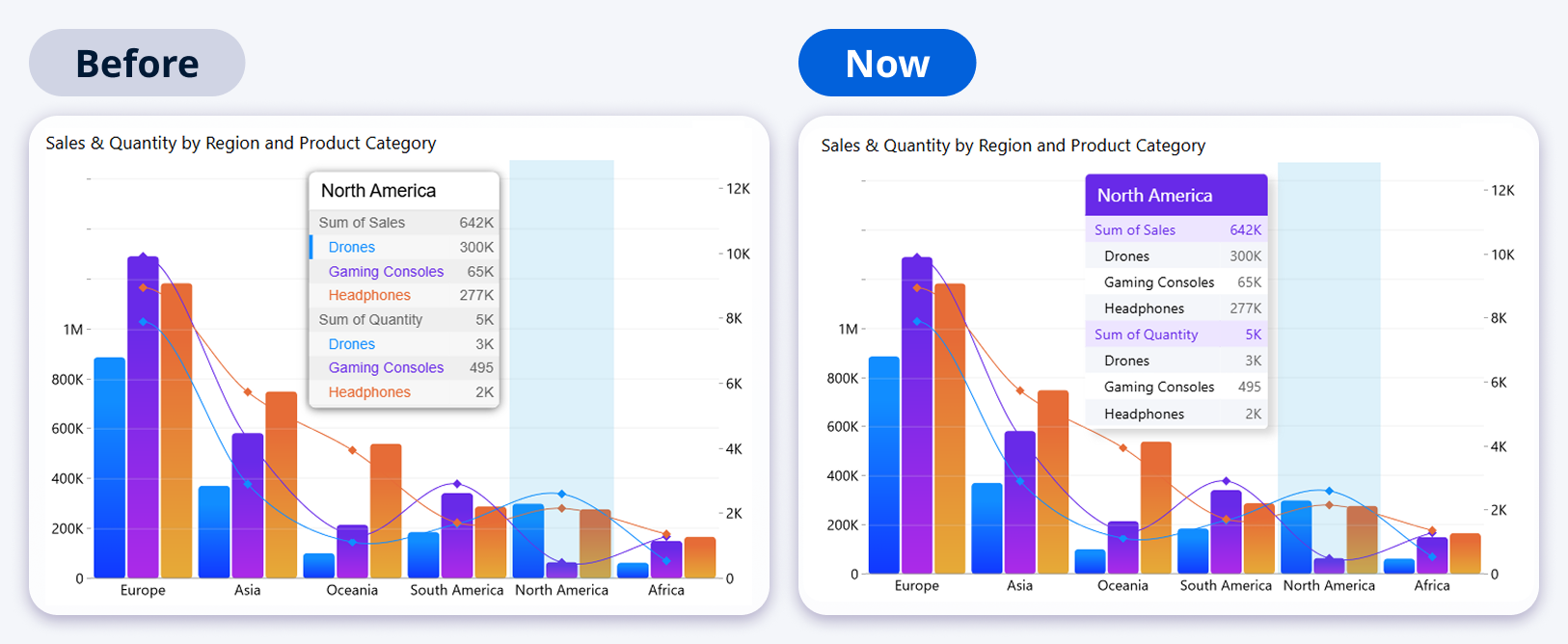
How to enable it
The settings become available under Tooltip Settings after enabling Customize Tooltip Settings. A new Series Total Background settings group then appears with the following options:
- Series total background color
- Series total background opacity (0 to 100)
- Series total font color
- Series total font family and font style (bold, italic)
- Series total font size


Coming in the Next Release
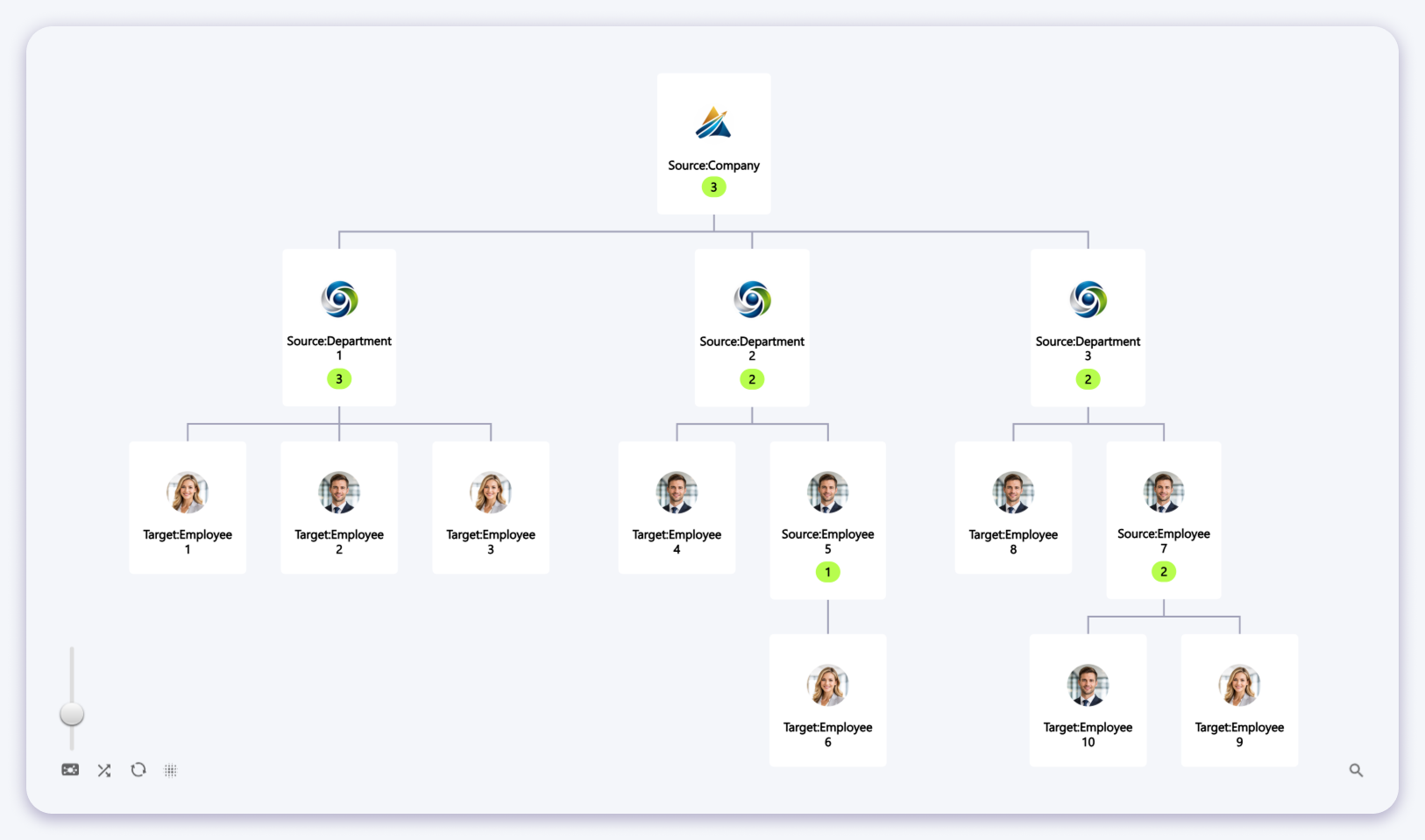
The next release will focus on larger additions. One of them is an organizational hierarchy view for the Graph PRO visual, a tree-style layout that displays company structures, reporting lines, and hierarchical relationships between nodes. Each node supports a custom image, and the green badge on parent nodes shows the number of direct children below it.
This feature is still in development and subject to change before release.
Get the latest version
All updates are available now through Microsoft AppSource. Existing users will receive the update automatically.
Get on AppSource View documentation


