Mar 02, 2026
February Update: Breadcrumbs, Multiple Change Thresholds and Full Tooltip Styling Control
This release focuses on something our users care about deeply: reducing manual work and improving report clarity.
We improved the way analysts build reports and how users understand them. Here’s what’s new.
This release focuses on something our users care about deeply: reducing manual work and improving report clarity.
We improved the way analysts build reports and how users understand them. Here’s what’s new.
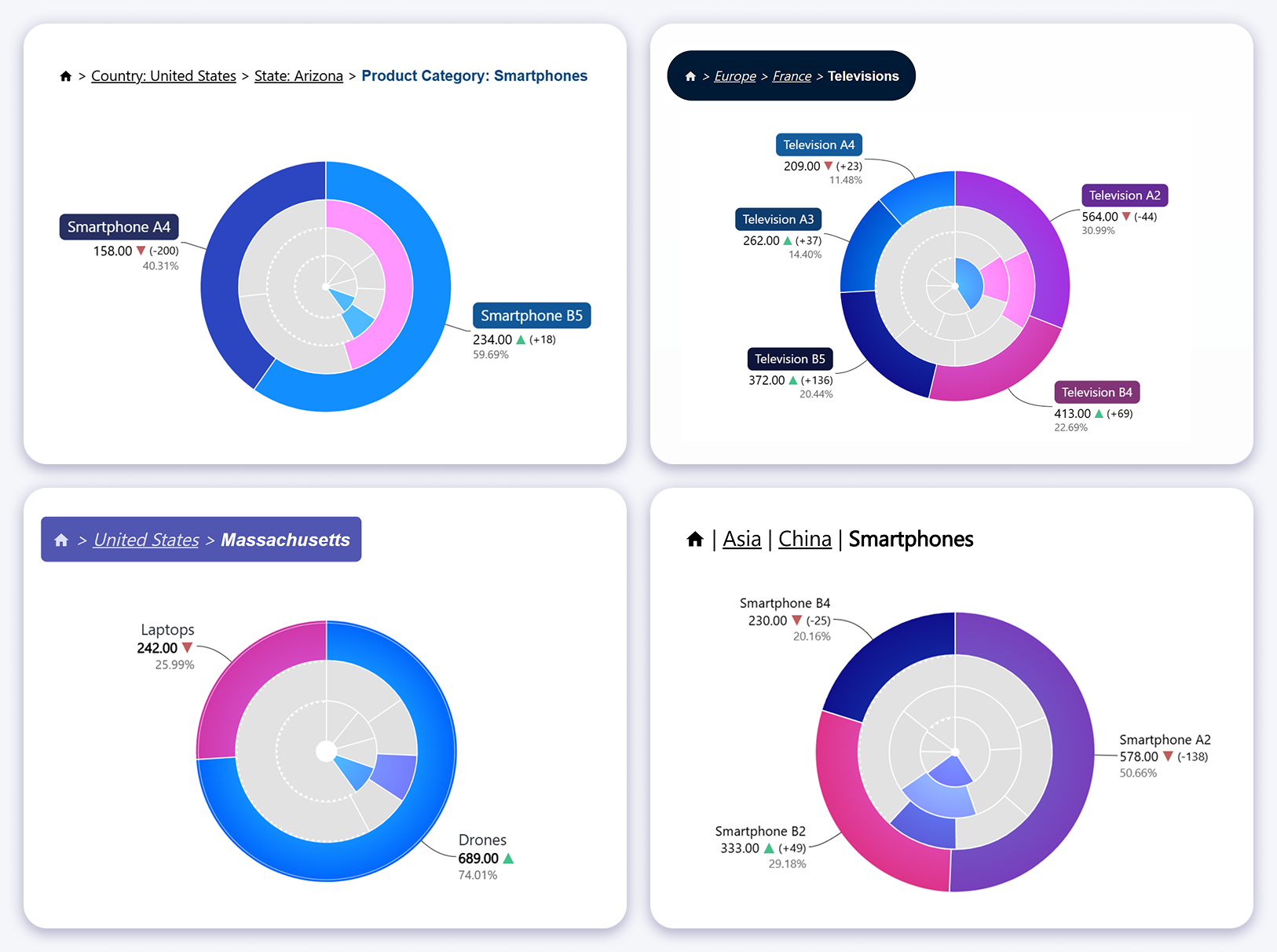
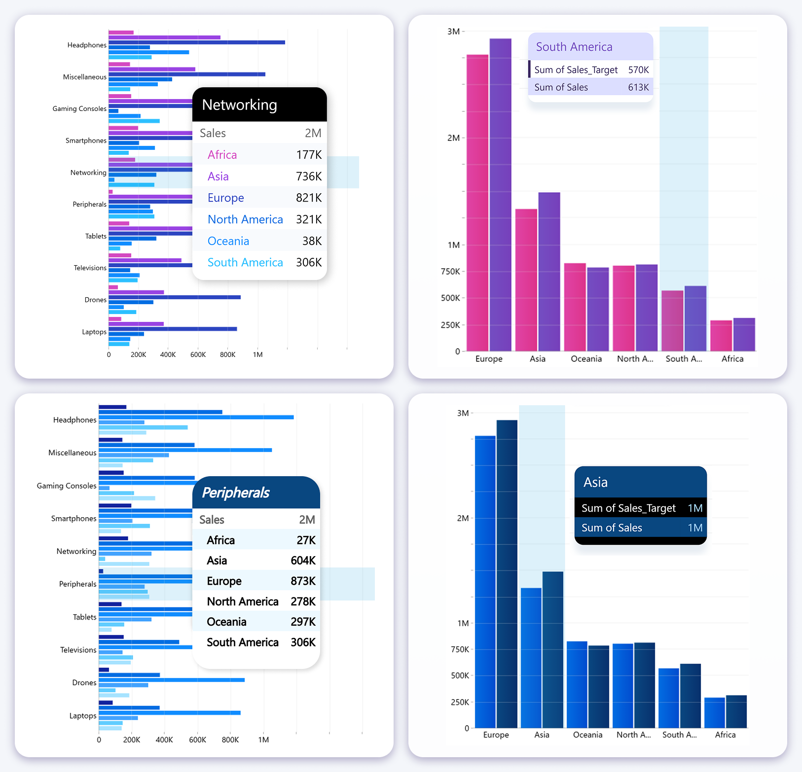
Breadcrumbs for Category Based Visuals
Breadcrumbs are now available across category-based visuals that support drill-down. The feature can be activated when more than one category level is present, displaying the current drill-down path directly inside the visual.
As users drill into deeper hierarchy levels, the breadcrumb updates dynamically to show exactly where they are. This removes the need to build custom breadcrumb solutions with DAX, calculated text fields, or supporting visuals.
Breadcrumbs are interactive. Clicking a previous level returns the visual to that hierarchy stage and updates the rest of the report page, making drill-down exploration faster and more intuitive for end users.
Breadcrumb support is now available in the following visuals:
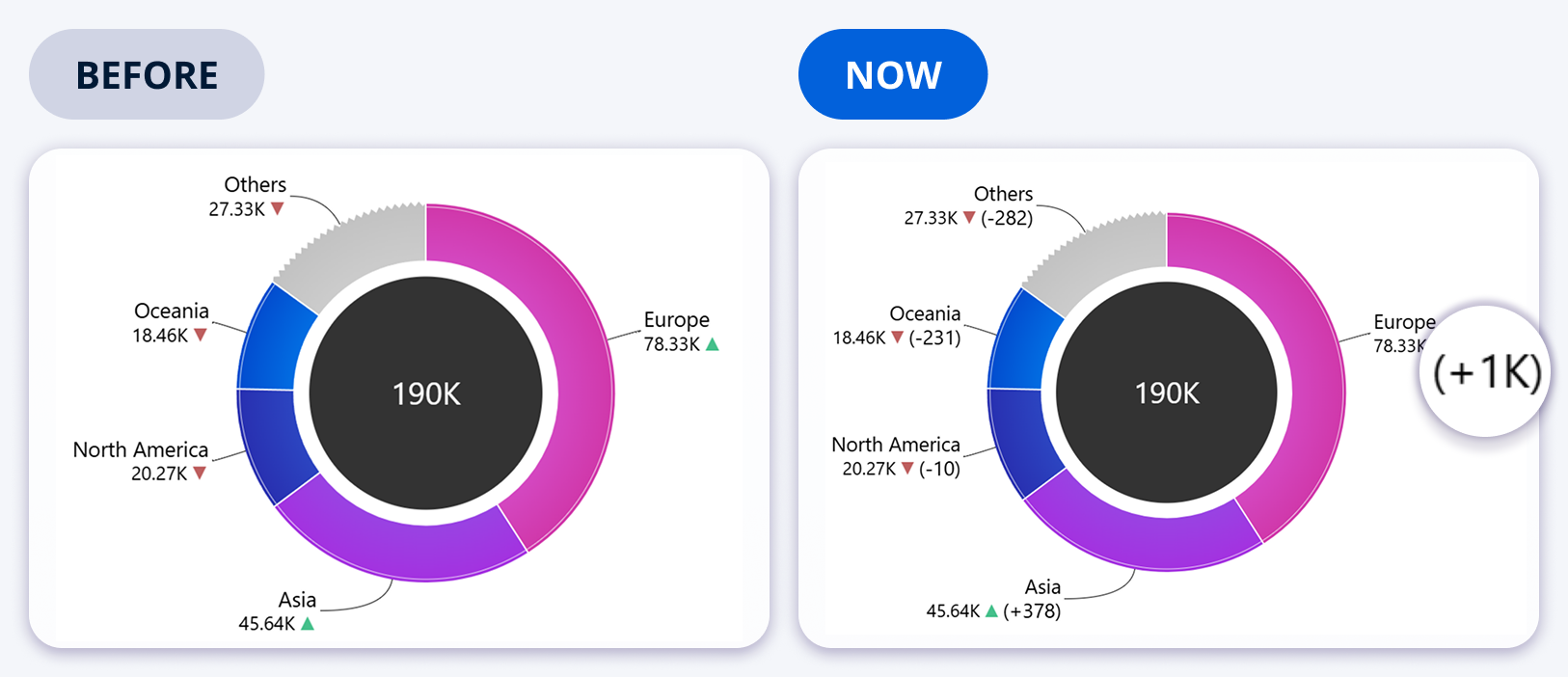
Donut Chart Change Indicator Label Improvements
The Donut visual supports reference comparisons, and this release improves clarity by adding a dedicated change indicator label. The label makes it explicit how differences between slices and their reference values are calculated and displayed.
This addresses ambiguity where users could misinterpret percentage differences, especially in target versus actual scenarios. The change indicator label can be configured to show absolute difference or relative change.
Formatting controls such as decimal precision and display formatting help align the output with dashboard standards and stakeholder expectations.
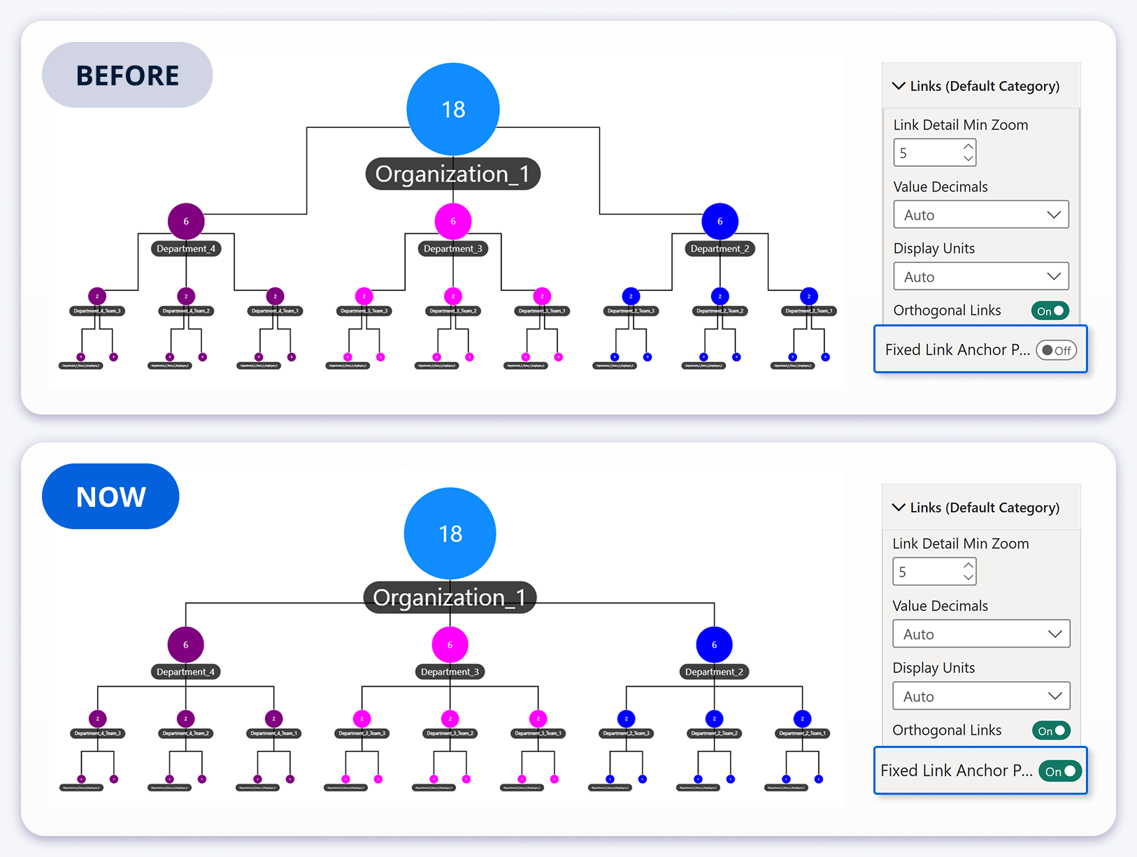
Graph Visual Optimized Orthogonal Links for Hierarchies
The Graph visual already supported orthogonal links, but hierarchy layouts previously produced link routing with multiple bends, reducing structural clarity in organizational style diagrams.
With fixed link anchor points enabled, connections bend at a single defined point, resulting in a cleaner, more consistent hierarchy view. When used with Hierarchy layout mode, the structure becomes easier to scan and present.
Vertical node spacing can be adjusted to control the distance and placement of bends relative to nodes, helping you tune readability for dense hierarchies.
Full Tooltip Style Customization
Facet-based visuals now support tooltip style customization. This addresses a common limitation where tooltip appearance was fixed and could clash with branded dashboards or grayscale themes.
Once tooltip customization is enabled, you can control core presentation elements such as header styling, background opacity, rounded corners, series text behavior, alternating row backgrounds, and shadow styling.
You can choose dynamic series coloring to inherit the series color from the chart, or use fixed colors to enforce consistent tooltip styling across the report.
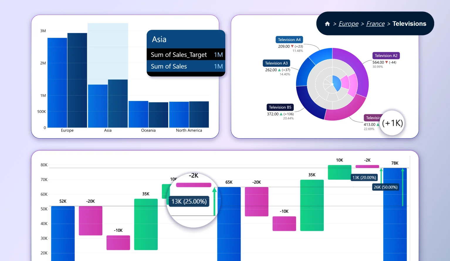
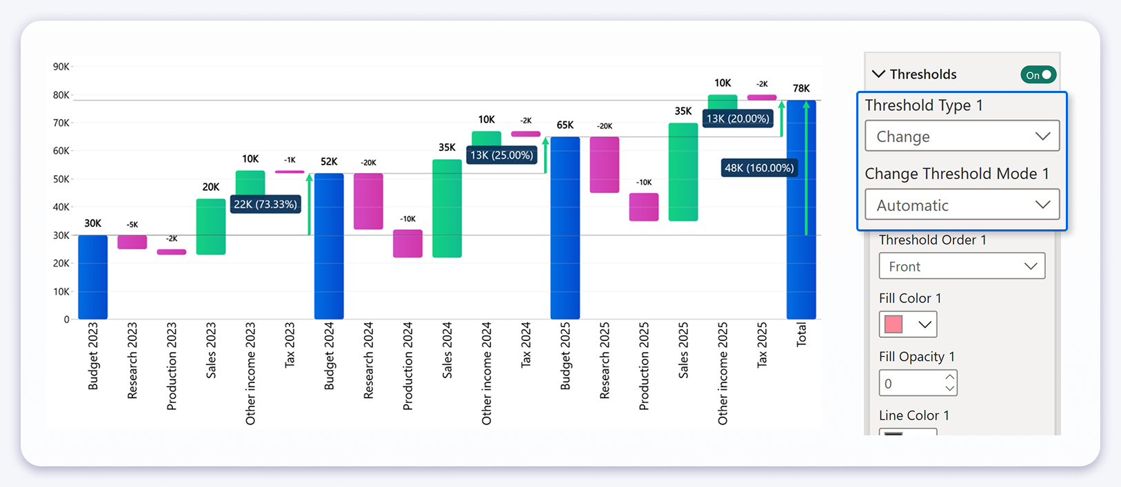
Waterfall Chart Multiple Change Thresholds Automatic Mode
The Waterfall visual previously supported change threshold calculation between the first and last value, which is useful for overall progression. This release expands that capability with Automatic mode, which calculates changes between each detected subtotal segment.
Automatic mode identifies subtotal columns and computes the delta between consecutive subtotals. Instead of a single overall change indicator, the visual displays multiple change indicators, one for each transition from one subtotal to the next.
This is especially valuable for multi period financial reporting. For example, when a Waterfall chart shows yearly totals with income and expense components inside each year, Automatic mode can show the change from Year 1 subtotal to Year 2 subtotal, and from Year 2 subtotal to Year 3 subtotal, without any additional modeling work.
The benefit is both technical and practical. Developers no longer need to build and maintain DAX measures for each subtotal to subtotal comparison, and stakeholders get a clearer narrative that explains how each period transitions into the next rather than seeing only a final outcome.
Automatic mode can complement the overall first to last comparison, allowing reports to communicate both the total movement and the intermediate movements within the same visual configuration.
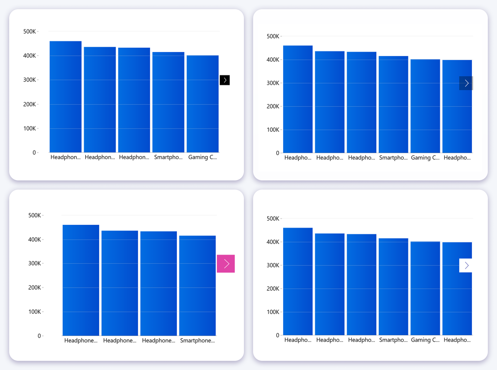
Navigation Arrows Improved Placement Option
Navigation arrows appear when the data exceeds the visible viewport or when zooming reduces the visible range. In dense visuals, arrows placed inside the plot area can overlap with data points and cause mis clicks.
A new "Arrow Location" setting lets you position arrows outside the plot area. This separates navigation controls from the data interaction area, improving click precision without changing navigation behavior.
This is most noticeable in charts with many categories, where navigation controls are frequently used and interaction accuracy matters.

Want more info like this?
Subscribe to our newsletter and be the first to read our latest articles and expert data visualization tips!


