logo
For Power BI
  • Products
    • Drill Down Donut Pro Drill Down Donut PRO
    • Drill Down Pie Pro Drill Down Pie PRO
    • Drill TimeSeries Pro Drill Down TimeSeries PRO
    • Drill Combo Pro Drill Down Combo PRO
    • Drill Map Pro Drill Down Map PRO
    • Drill Scatter Pro Drill Down Scatter PRO
    • Drill Down Network Pro Drill Down Network PRO
    • Drill Down Waterfall Pro Drill Down Waterfall PRO
    • Drill Down Graph Pro Drill Down Graph PRO
    • Drill Down Timeline Pro Drill Down Timeline PRO
    • Drill Down Combo Bar PRO Drill Down Combo Bar PRO
    • Drill Down Line PRO Drill Down Line PRO

    Video tutorials

    Watch Now

    More than 90 videos on how to enhance Power BI with ZoomCharts

    Learn more
    All visuals
  • Resources

      Resources

    • Documentation
    • Report Examples
    • Blog
    • Webinars
    • Video Tutorials
    • Visuals Gallery

    Support

    • ZoomCharts Assistance
    • Contact Sales
    • Contact Support
    • FAQ

    Challenges

    Challenges

    Improve your report creation skills by participating in free challenges for report creators.

    Learn more
    Start trial
  • Services
    • Power BI Report Development
    • Custom Visual Development
  • Challenges
  • Pricing
Request a quote Start Free Book a Demo Sign in
Get it now
Go back

Contents

Go back

Apr 30, 2025

April 2025 Update: Multiple Links in Graph PRO & Total Labels for Stacks

Create multiple links between nodes in Graph, enable and customize value labels for stack totals in Combo & Timeline, and more – read about what’s new in ZoomCharts visuals in April!
Title image
Title image

Create multiple links between nodes in Graph, enable and customize value labels for stack totals in Combo & Timeline, and more – read about what’s new in ZoomCharts visuals in April!

Contents

Share this article

Your visuals should update automatically from AppSource. If your visuals have not received the updates automatically, read this documentation article that explains the manual update process.

Combo, Combo Bar, Timeline: 'Total' Value Labels for Stacks
Enable and customize 'Total' stack value labels in ZoomCharts Combo, Combo Bar, Timeline

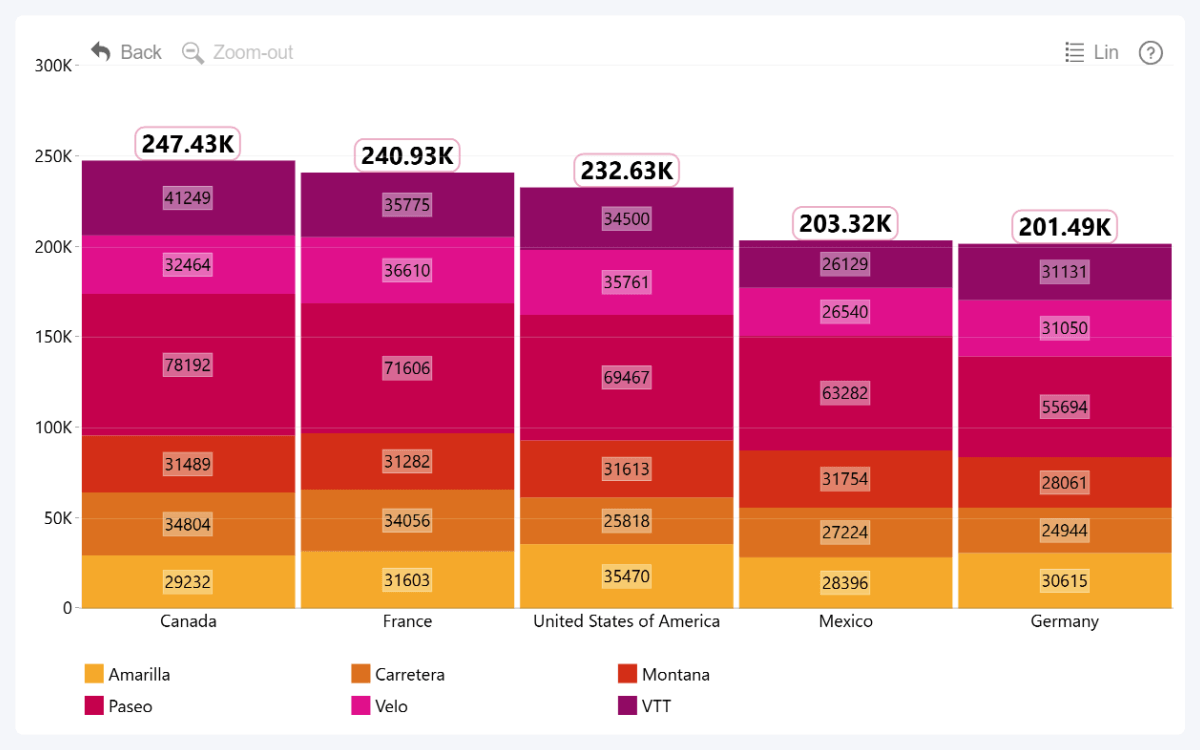
The April 2025 update for Combo, Combo Bar, and Timeline visuals will bring great news for report creators who like to build stacked charts. Now, you can enable and configure a Total value label which will display the cumulative value for the entire category or time unit. 

When using Stacked display mode, you will now find the following toggles in the Series Defaults section:

  • Series Value Labels Defaults: Enables value labels for all series or Legend segments.  Once enabled, reveals Series Value Labels Defaults section where you can configure the default label appearance for all series or legend segment value labels.
  • Series Total Value Labels Defaults: Enables Total value labels that will show the total stack value for the entire category or time unit. Once enabled, reveals Series Total Value Labels Defaults section where you can configure Totals value label appearance.

Of course, you can also apply series-specific settings – Series X Value Labels and Series X Total Value Labels - in the Series X Configuration section of the series you wish to configure. If enabled, they will take priority over Series Defaults.
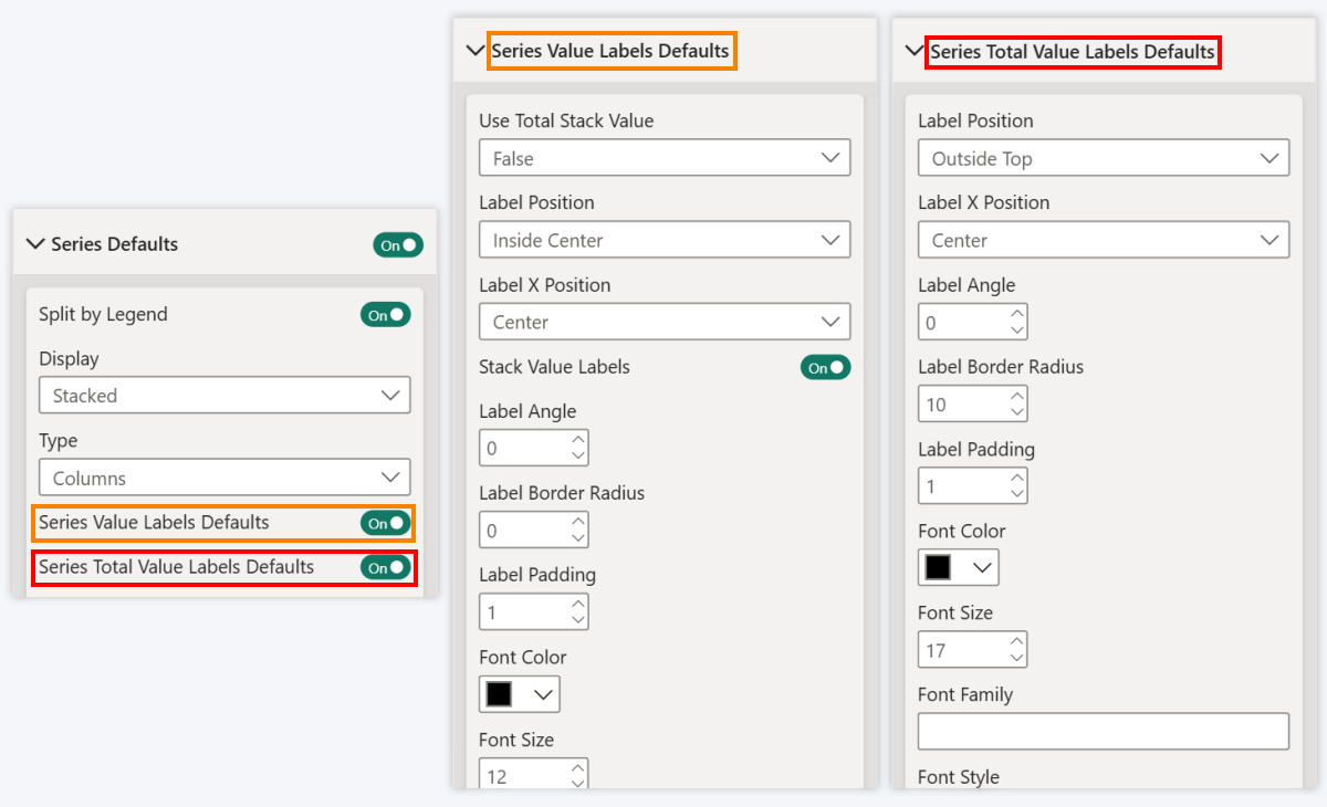
Customize Value Labels and Total Value Labels separately in Combo, Combo Bar, Timeline

This new feature will make it easier to configure the stack appearance. You can now easily apply separate customization settings to the Total value label to visually distinguish it from other labels – for example, make the font bigger, alter display units or value decimals, change position, or apply specific colors. This also means that if you want to declutter the chart and display just the Totals, you can enable them while disabling other value labels.
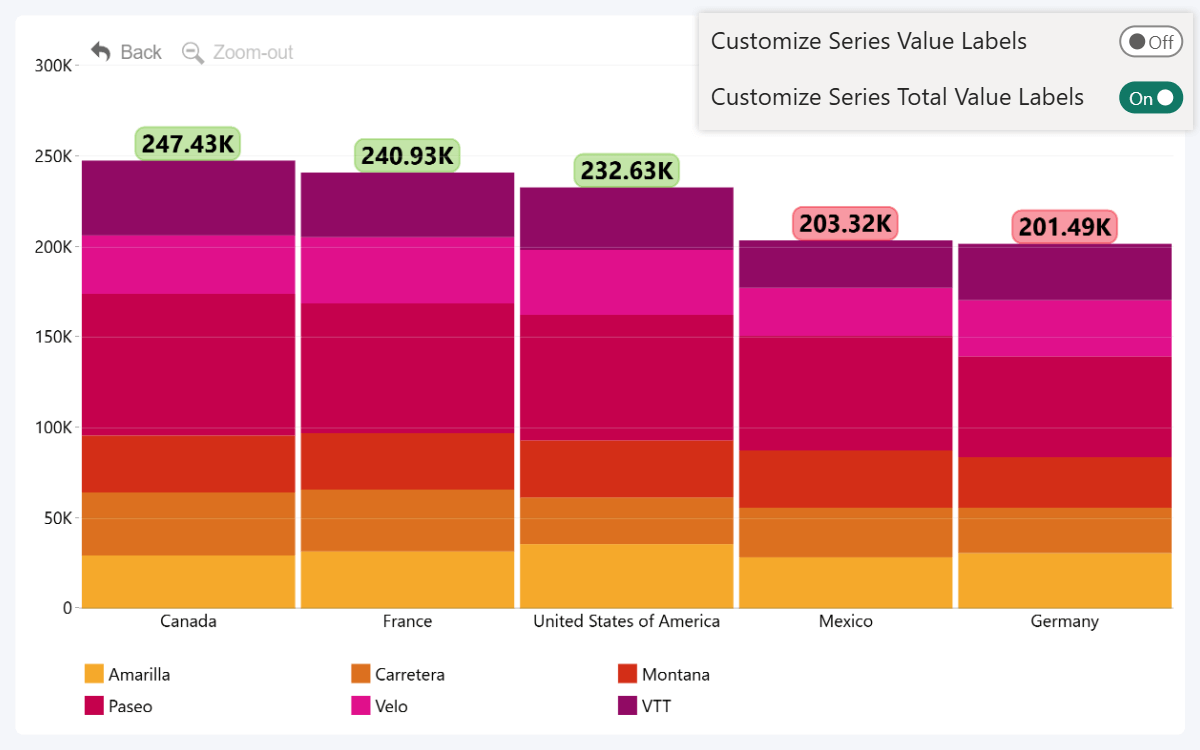
Disable value labels and show only Totals when splitting by Legend

This will come in especially handy when using the Legend field to split series values into segments (read more about Legend field here). Previously, the value labels were all-or-nothing – either display the values for every segment, or none at all. Now, if you want to display just the total category or series value while hiding individual segment values, simply enable Totals while leaving the rest disabled.

Timeline, TimeSeries: Show Decades as Major Units
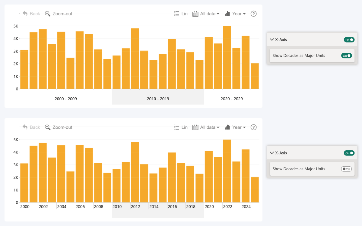
Show Decades as Major Units in ZoomCharts Timeline and TimeSeries - on vs off comparison

The April 2025 update for our two time-based visuals also introduces more control over the display units. By default, the visual will automatically combine each decade into a single axis unit if the view contains multiple decades (for example, “2010-2019”). 

You can now disable this behavior using the Show Decades as Major Units toggle within X-Axis section, which will force the visual to display years as the major time axis units. If there is no space to fully display the label for each year, the visual may omit some labels (for example, by skipping every other year). 

Graph: Multiple Links Between Nodes

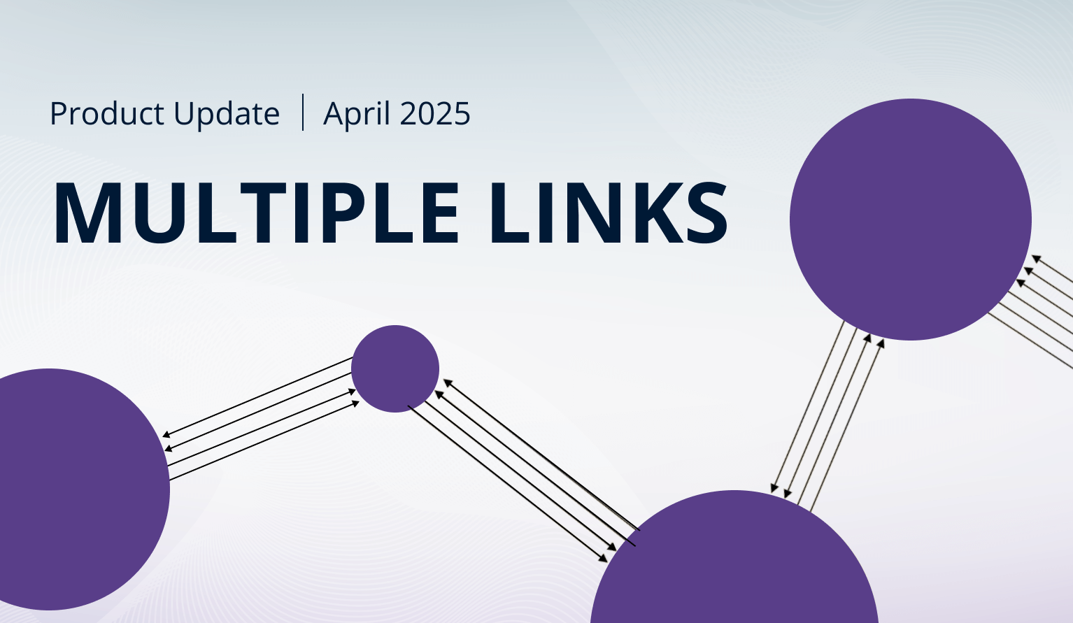
The April 2025 update for Graph PRO introduces a new optional field – Link ID. Essentially, it allows you to provide unique IDs for each link you want to create, enabling you to connect multiple parallel links between a pair of nodes.

Without Link ID, Graph PRO will create links like before. Each relationship between Source and Target nodes will be represented as a single link. This means that a pair of nodes may have max two links – one in each direction.
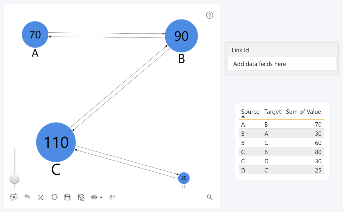
How links are created in Graph with just Source Nodes and Target Nodes fields and without Link ID

However, when using the new Link ID field, a separate link will be created for each row with a unique link ID string. For example, if there are three rows with the same Source and Target node IDs, but each row has a unique link ID, this means that the visual will display three parallel links.

Furthermore, the Link Color, Label, Category, and Width fields will affect each link separately – in this example, we also used the same Link ID column as the link label to better illustrate the effect.
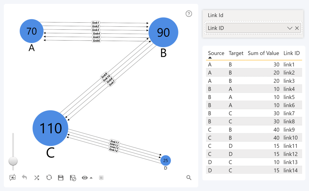
ZoomCharts Graph PRO - multiple links when using Link ID fields. Unique link for each Link ID row

This will be useful in many different scenarios. For example, in supply chain management, each link may represent a unique shipment from one place to another. Alternatively, each money transaction between two parties can be visualized as a separate link.

Map, Shape Map: Minor Style Tweaks to 'Lasso' Button
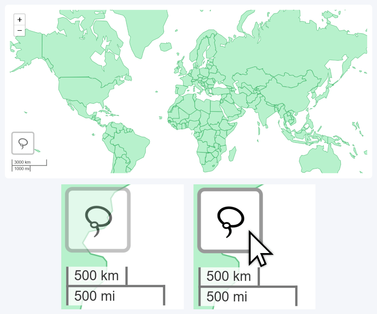
Lasso Tool Button in ZoomCharts Drill Down Map PRO and Shape Map PRO

Lastly, we have slightly altered the Lasso toolbar button in our Map PRO and Shape Map PRO visuals by adding a semi-translucent background and a rectangular outline, which will ensure its visibility when navigating the chart. In addition, enabling Dark Mode in Toolbar settings will invert the Lasso button color to dark gray.
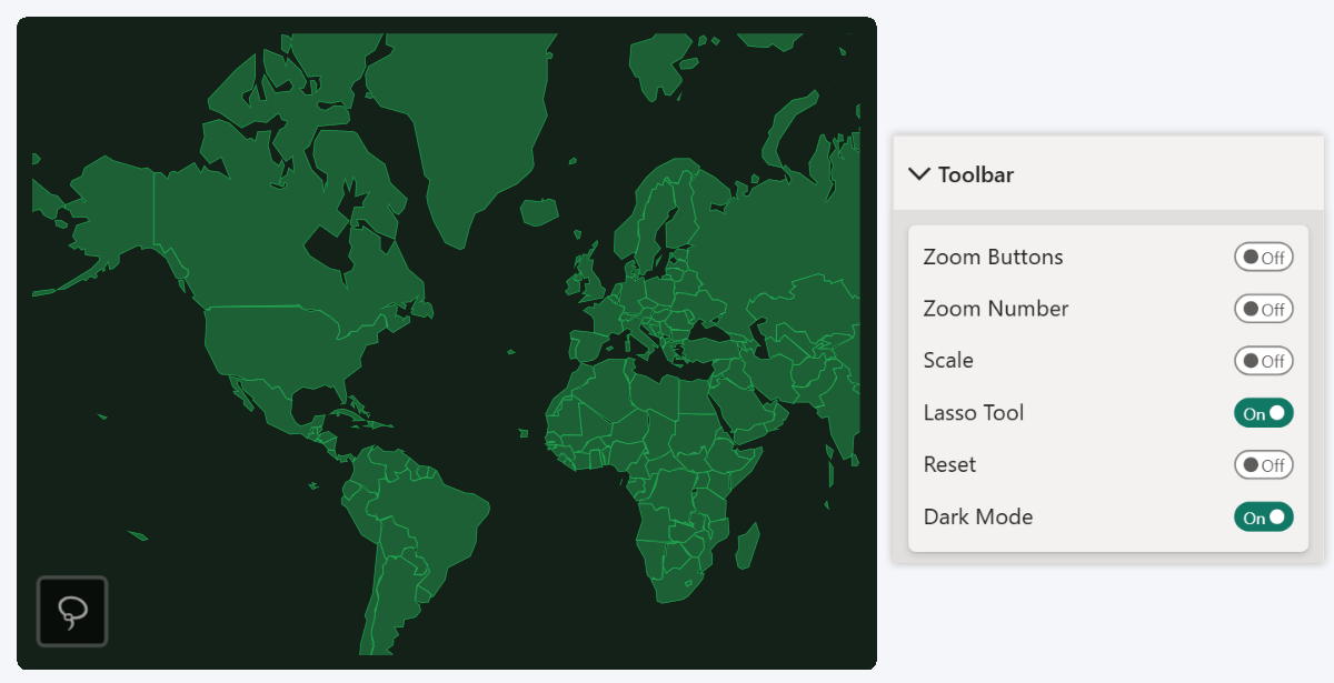
Lasso Tool button in Dark Mode

Like many other features, this change was suggested by one of our clients. If you wish to provide feedback about ZoomCharts products or suggest new features, you can get in touch with our team using this contact form. In addition, our Custom Visual Development Service is also available if you need a tailor-made visualization for your specific use case.

Get Started with ZoomCharts

Be sure to download the latest version of ZoomCharts Visuals to enjoy these new additions, along with hundreds of other features! With a free trial available, you can see for yourself how these powerful visuals can take your Power BI reports to the next level.

  • Drill Down Combo PRO
  • Drill Down Combo Bar PRO
  • Drill Down Timeline PRO
  • Drill Down TimeSeries PRO
  • Drill Down Graph PRO
  • Drill Down Map PRO & Shape Map PRO
envelope icon

Want more info like this?

Subscribe to our newsletter and be the first to read our latest articles and expert data visualization tips!


Find out more

Oct 18, 2022

Blog Thumbnail
Guides

Create a Power BI Org Chart & More with Drill Down Graph PRO

Drill Down Graph PRO is one of our most advanced data visualization tools, and in this article, we will explore the many ways you can use it in your Power BI reports, including org charts, AML graphs and more. Furthermore, we will go through some tips & tricks on how to create graphs in Power BI with this powerful visual.

Jun 12, 2022

Blog Thumbnail
Guides

Power BI Waterfall Charts: A Detailed Guide

Do you know how to make a waterfall chart? Here are 7 tips you should know when building user friendly Power BI waterfall charts. Customize it to tell a data story that helps you make data driven decisions. Bar and column charts work great for visualizing a beginning and ending value. However, these charts fail to display the full data story by leaving out all the unique factors that contribute to a final net value. In this article, we will look at the basics of waterfall charts and what practices you can implement to build the best waterfall charts in Power BI.

Jul 01, 2022

Blog Thumbnail
Use cases

Microsoft Integrates ZoomCharts in Dynamics 365 Supply Chain Insights

We are excited to announce the collaboration between Microsoft’s latest product – Dynamics 365 Supply Chain Insights – and technologies provided by ZoomCharts – the Network and Map visuals.

Feb 14, 2022

Blog Thumbnail
Guides

Everything You Need To Know About Power BI Bar Charts

Power BI bar charts are a simple and efficient way to show category-based data. Almost everyone has used a bar chart, which is why they've remained incredibly popular through the years. In this article, we will explore the many ways you can make Power BI bar charts even more powerful and use them to the max.

Dec 16, 2021

Blog Thumbnail

How We Turned Many Excel Files Into an Interactive Power BI Report about Latvia’s Export landscape

How We Turned an Excel Sheet Into an Interactive Report: Latvia Export Barometer. ZoomCharts took part in a widescale project that created a full report of...

Sep 04, 2022

Blog Thumbnail
Guides

Power BI Donut Chart

The donut and pie charts are some of the most ubiquitous charts around. Instantly recognizable by people who have very little to do with charts, every report creator is bound to have to include a Power BI donut chart into a report at some point. This is not a commentary on whether you should love or hate donut charts, but rather a guide on getting the most out of donut and pie charts. Strap in tight, we're going to go over the whys, hows, do's and don'ts of Power BI donut charts.
  • «
  • 1
  • ...
  • 5
  • 6
  • 7
  • 8
  • 9
  • 10
  • 11
  • »

Contents

Share this article

Want more info like this?

Subscribe to our newsletter and be the first to read our latest articles and expert data visualization tips!


Thank you!

Check your inbox to verify your email address.

logo
[email protected]
+44 204 577 3993
logo

Products

Drill Down Network PRO Drill Down Waterfall PRO Drill Down Graph PRO Drill Down Combo PRO Drill Down Combo Bar PRO Drill Down Donut PRO Drill Down Pie PRO Drill Down TimeSeries PRO Drill Down Timeline PRO Drill Down Map PRO Drill Down Scatter PRO All Visuals

Resources

Report Examples Webinars Blog ZoomCharts Academy Visuals Gallery Documentation Custom Visual Development Subscribe to News

Solutions

Custom Visual Development

Company

Pricing About Us Partners Leave feedback Join PowerGroup EU Funding

Help

ZoomCharts Assistance Contact Sales Contact Support FAQ

Drill Down Network PRO Drill Down Waterfall PRO Drill Down Graph PRO Drill Down Combo PRO Drill Down Combo Bar PRO Drill Down Donut PRO Drill Down Pie PRO Drill Down TimeSeries PRO Drill Down Timeline PRO Drill Down Map PRO Drill Down Scatter PRO All Visuals

Report Examples Webinars Blog ZoomCharts Academy Visuals Gallery Documentation Custom Visual Development Subscribe to News

Custom Visual Development

Pricing About Us Partners Leave feedback Join PowerGroup EU Funding

ZoomCharts Assistance Contact Sales Contact Support FAQ
+44 204 577 3993
[email protected]

Ready to get in touch?

Contact our experts with any question about Power BI and ZoomCharts for Free!

Contact us

© 2025, Data Visualization Software Lab

U.S. Patents No. 11,645,343; 11,921,804

Cookies Policy
Manage cookies
Privacy Policy
Global
EULA
Patent
warning

Error message

success

Success info: Done!

ZoomCharts AI Assistant

We noticed you're using an old OS version.

For the best experience, we recommend upgrading to ensure that all website features display correctly.

Cookie settings

We use necessary cookies for site functionality, as well as statistic, marketing, and preference cookies to enhance your experience. For more information and to manage your preferences, please visit our Cookie policy