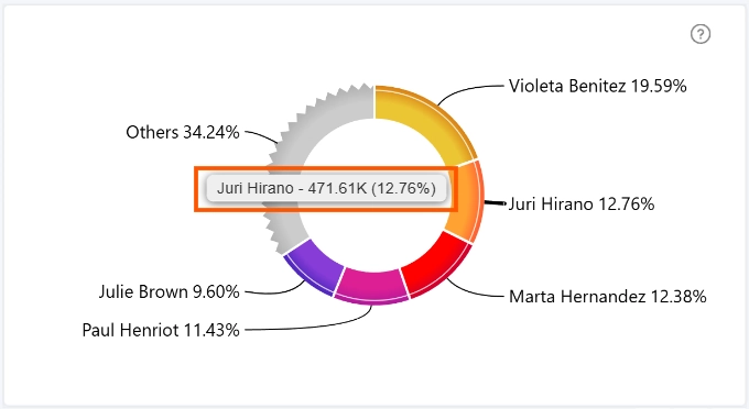
Tooltips provide additional information when users hover over a donut slice. You can enable or disable tooltips using the toggle option.
The following settings are available:
- Type: specifies the tooltip type and allows you to enable custom tooltip styling.
- Header*: controls the appearance of the tooltip header.
- Container*: customizes the tooltip container's appearance.
- Text*: controls the formatting and appearance of tooltip text.
- Values: controls how numeric values are displayed in the tooltip.
- Shadow*: customizes the shadow effect around the tooltip container.
*Available when Customize Tooltip Style is enabled.
You can display additional info in the tooltip by adding the desired columns to the Tooltip Content field. Read more in the Tooltip Content documentation page.
Was this helpful? Thank you for your feedback!
Sorry about that.
How can we improve it?