DAX is what separates a Power BI report that displays data from one that answers questions. These twelve formulas are the ones every report creator relies on daily, covering conditional calculations, safe division, row-by-row aggregation, and multi-tier bucketing. Each one includes syntax, a real example, and the exact use cases where it earns its place.
Power BI gives you the platform. DAX gives you the precision. By mastering these expressions you will be able to perform advanced calculations across rows and tables, organize and transform data without touching the source, and deliver more focused and valuable insights to your users.
For deeper DAX learning, these resources are worth bookmarking:
All 12 formulas at a glance
| Formula |
What it does in one line |
| CALCULATE |
Evaluate any expression within a new filter context |
| SUMX |
Sum a calculated value across every row in a table |
| ALL |
Remove all filters and return the grand total |
| DIVIDE |
Divide safely with a fallback for zero-denominator errors |
| ADDCOLUMNS |
Add new calculated columns to an existing table |
| SELECTCOLUMNS |
Create a new table with only the columns you need |
| SUMMARIZE |
Group and aggregate data into a summarized table |
| FILTER |
Return only the rows that match a condition |
| RELATED |
Pull a value from a related table into the current one |
| IF |
Return one of two values based on a true/false condition |
| SWITCH |
Handle multiple conditions without nesting IF statements |
| RANKX |
Assign a rank to each row based on a measure value |
CALCULATE: The Brain of DAX
Change the filter context of any expression
Most important
CALCULATE([expression], [filter1], [filter2])
What it does
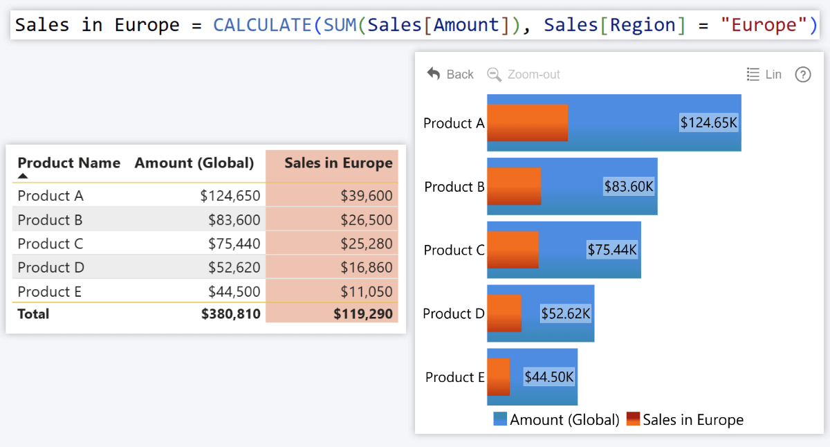
CALCULATE changes the context of a calculation. Think of it as saying "Do this, but only for specific data." It evaluates your expression (like SUM, DIVIDE, etc.) but within a new filter condition. Nearly every advanced DAX measure relies on CALCULATE at some level.
Example
Your report shows global sales, but you need to limit the data to Europe. CALCULATE evaluates the sum of Sales[Amount] but only for rows where Sales[Region] is "Europe".
Use cases
- Region-specific KPIs
- Time-based data (e.g. "last 30 days")
- Time intelligence (e.g. comparing current vs. same period last year)
- Customer segmentation (e.g. "VIP Clients", "New Users")
SUMX: Add Calculated Values Across Rows
Row-by-row evaluation before summing
Iterator
SUMX([table], [expression])
What it does
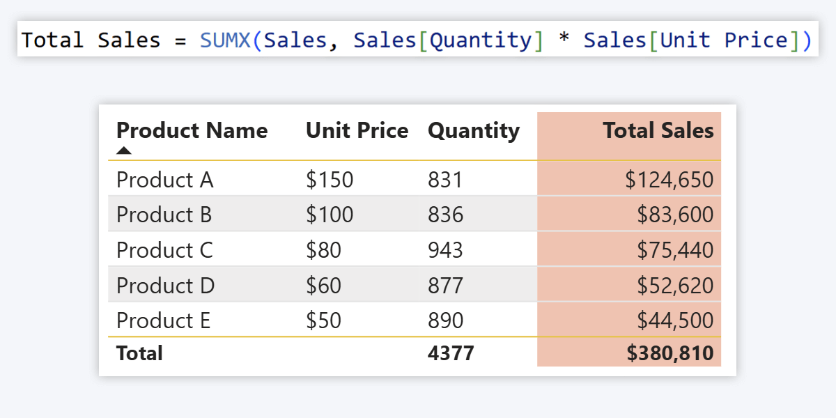
Whereas SUM calculates the total of a single existing column, SUMX goes row by row to evaluate an expression across one or multiple columns, then adds all the results together. Use it when the value you need to sum does not exist as a column yet.
Example
Your data has Sales[Quantity] and Sales[Unit Price] but no revenue column. SUMX multiplies them per row then sums all results to give you total sales amount.
Use cases
- Calculate totals across multiple columns (e.g. sales revenue per product line)
- Determine profit (revenue minus expenses per row)
- Use with ALL to see totals even on filtered tables
- Apply varying tax rates per row before summing
ALL: Ignore Filters
Always return the grand total regardless of slicers
Filter modifier
ALL([table])
What it does
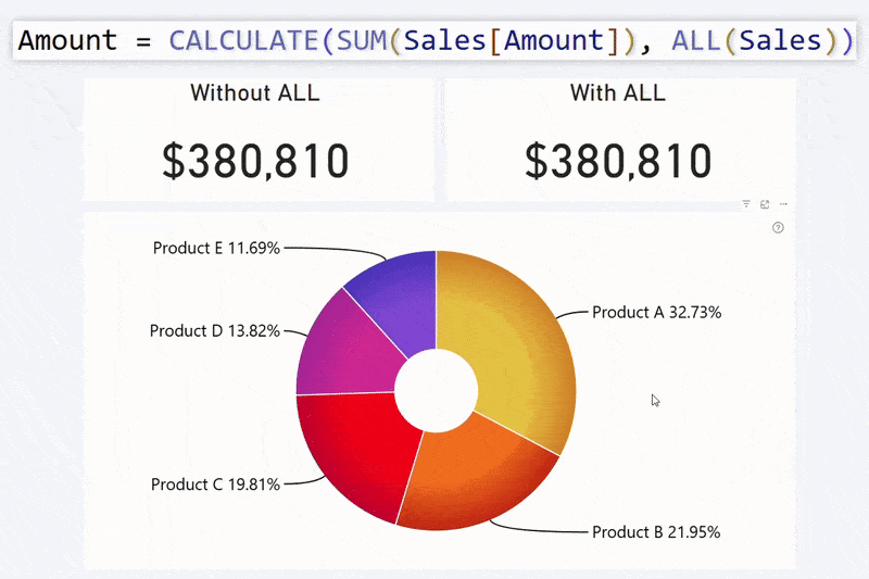
When you always need the total column value, ALL ensures that filters or slicers are ignored and your measure returns the grand total across all rows, regardless of what the user has selected on the page.
Example
Inside a CALCULATE expression, ALL ensures you always see the total global sales amount even when the user filters to a specific region or product. Useful for KPI cards or as the denominator in a percentage-of-total measure.
Use cases
- Calculate percentage of total
- Show baseline figures in KPI cards
- Normalize values across categories
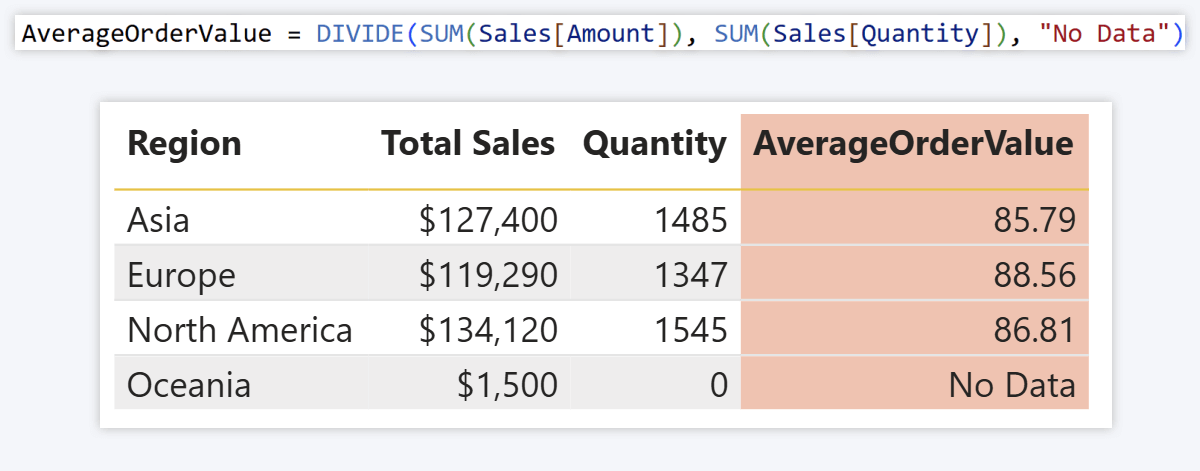
DIVIDE: Safe Division Between Two Values
Never break a visual with a divide-by-zero error
Error-safe
DIVIDE([numerator], [denominator], [fallback value])
What it does
Divides one number by another. When the denominator is zero, NaN, or missing, it returns a fallback value instead of a divide-by-zero error, keeping your visuals clean and your users unconfused.
Example
Calculating Average Order Value by dividing Sales[Amount] by Sales[Quantity]. When a row has no sales, instead of breaking the visual the fallback value is returned. Using "No Data" rather than 0 signals missing data rather than zero revenue, which matters for the accounting department.
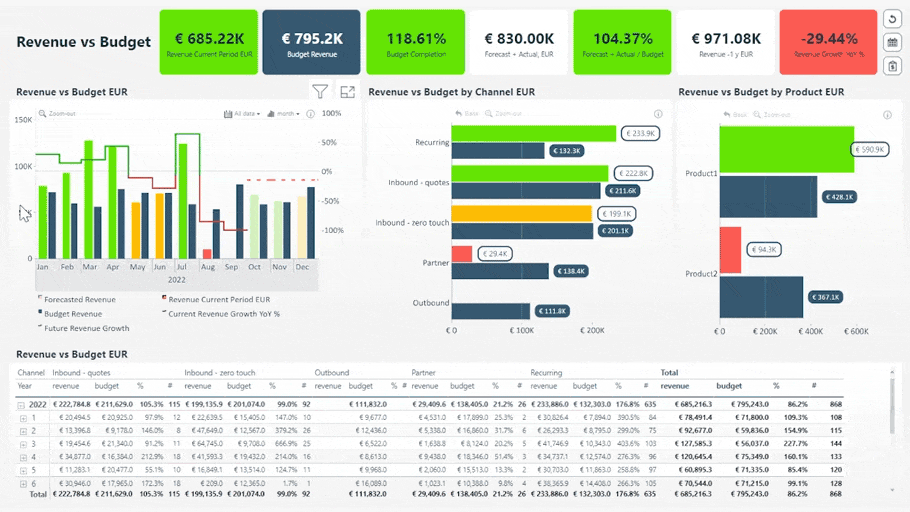
4U Reports connection
DIVIDE is the foundation of the Budget Variance %, Maverick Spend Rate, and On-Time Delivery Rate measures in the 4U Procurement Report. See the full DAX implementation there.
Use cases
- KPI completion percentages
- Conversion rates
- Metrics like Customer Acquisition Cost, ARPU (read more)
ADDCOLUMNS: Add New Columns to a Table
Extend an existing table with calculated columns
Table function
ADDCOLUMNS([table], "new column name", [expression], ...)
What it does
Adds new calculated columns to an existing table. Unlike measures which perform on-the-fly calculations, ADDCOLUMNS columns are permanent parts of the table calculated row by row.
Example
Your Sales table has Sales[Cost] and Sales[Amount]. To show profit per sale, ADDCOLUMNS creates a "Profit" column subtracting Cost from Amount:
ADDCOLUMNS(Sales, "Profit", Sales[Amount] - Sales[Cost])
Use cases
- Extract new insights from existing data
- Add calculated columns without affecting the original table
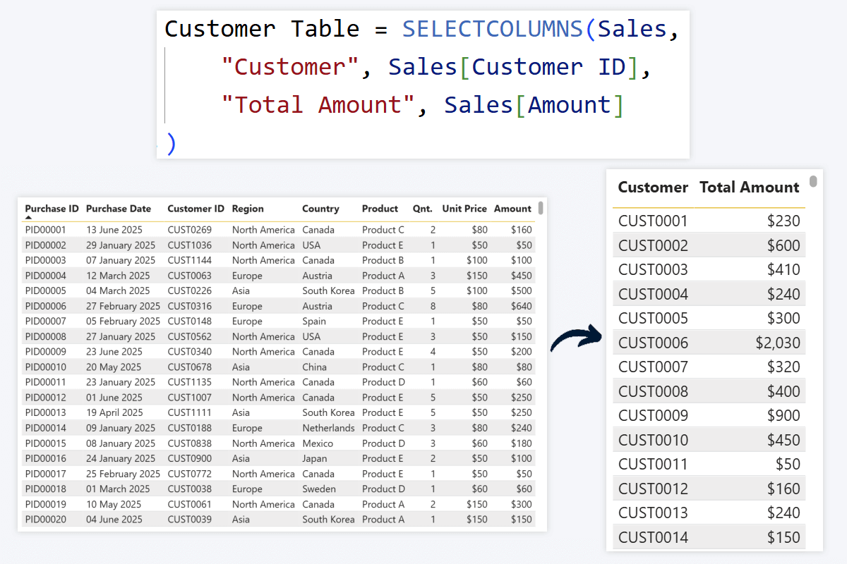
SELECTCOLUMNS: Create a New Table with Just the Fields You Want
Reduce a wide table to only what you need
Table function
SELECTCOLUMNS([table], "new column name", [expression], ...)
What it does
Similar to ADDCOLUMNS but creates a brand-new table containing only your selected columns, copied as-is or with expressions applied. Useful for simplifying a wide table without modifying the original.
Example
Your Sales table has 30 columns but you only need Customer ID and Amount. SELECTCOLUMNS creates a two-column table.
Use cases
- Simplify data and optimize query performance
- Transform data without affecting the original table
- Create lookup or reference tables
- Control which data is exposed in a view
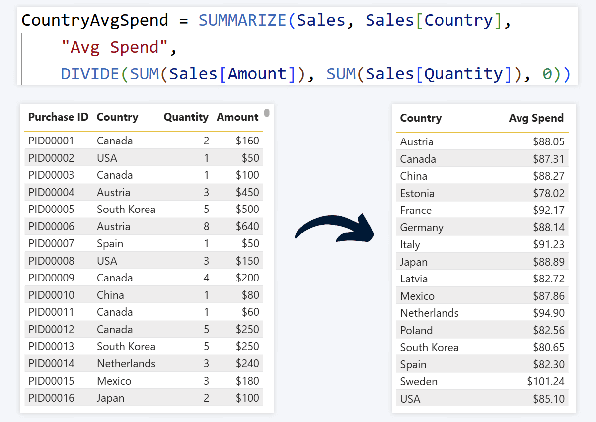
SUMMARIZE: Create New, Summarized Tables
Group data and reduce query size for better performance
Performance
SUMMARIZE([table], [category column], "summary column name", [expression])
What it does
Groups your data using one or more category columns and creates a new table with only summarized values. If you have used pivot tables in Excel this will feel familiar. Essential for simplifying your data model and improving report performance.
Example
Your fact table has a row per purchase. You want a summarized table showing average product sale price per country to inform pricing strategy. SUMMARIZE groups by Sales[Country] and applies DIVIDE to calculate the average.
Use cases
- Simplifying data and optimizing queries
- Visualizing category-based insights (total revenue per country, units per brand)
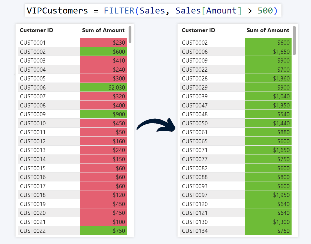
FILTER: Keep Only the Rows You Want
Return a table containing only rows that match a condition
Table function
FILTER([table], [condition])
What it does
Returns a filtered version of a table keeping only rows where the condition is true. All columns from the original table are preserved but only for the matching rows.
Example
To create a table of only high-paying customers, FILTER keeps only rows where Sales[Amount] exceeds $500. You can also match text: Sales[Country] = "United States".
Use cases
- Filter by value condition (high-paying customers, risk groups)
- Filter by category (region, country, brand, demographic)
- Filter to a specific time period
Reference a column from a related table
Relationship
RELATED(table[column])
What it does
When your data model has relationships between tables, RELATED fetches a value from a related table into the current one based on the defined relationship. Essential for multi-table data models.
Example
Customer data (region, country, name) lives in a dimension table. You want to FILTER your sales fact table to only rows where the customer is in Asia. RELATED lets you reference Customers[Region] inside the FILTER condition on the Sales table.
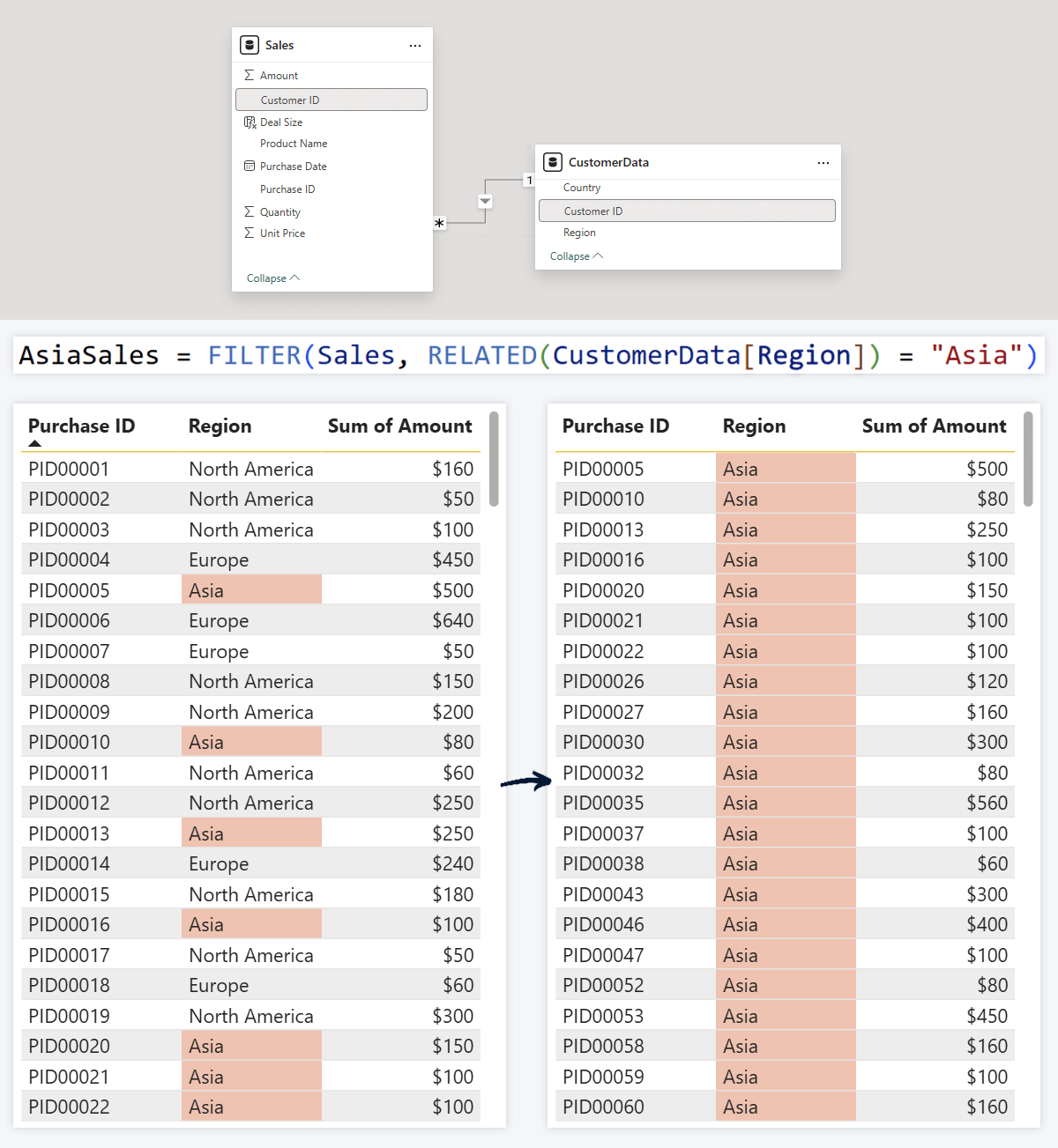
Use cases
- Enrich fact tables with dimension data
- Display additional details in tooltip fields
- Use inside FILTER, SELECTCOLUMNS, or CALCULATE
IF: Do "This" or "That"
Return one of two values based on a condition
Conditional
IF([condition], [outcome if true], [outcome if false])
What it does
IF statements are the cornerstone of almost any programming language, and DAX is no exception. It checks each value against your condition and returns one result if the condition is met, another if it is not.
Example
Tag each sale as "High" or "Low" based on its value: if above $250 it is high, otherwise low. IF checks each row and returns the correct label.
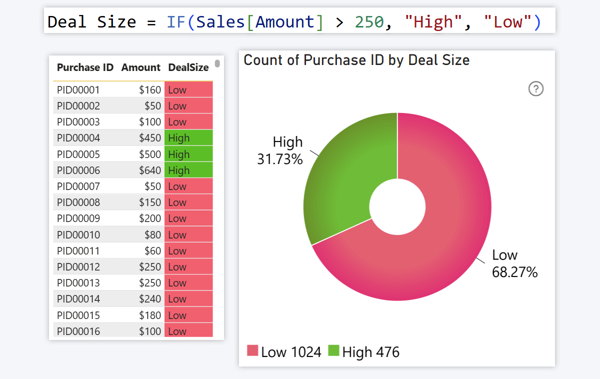
Use cases
- Labels, tooltip fields, simple alerts
- Gauge or pie chart categories (e.g. % of sales above $250)
- Conditional formatting (green/red based on condition)
SWITCH: Multi-Condition IF
Handle multiple conditions without nested IF statements
Conditional
SWITCH([expression], [condition1], [outcome1], [condition2], [outcome2], ..., [else])
What it does
When you need more than two outcomes, SWITCH lets you stack multiple conditions and outputs in a single clean expression, with no nested IF statements required.
Example
Instead of two tiers (IF), SWITCH creates four: "Very High" above $500, "High" from $251 to $500, "Medium" from $101 to $250, and "Low" for everything else. You can use other operators beyond "more than", including exact matching with "=".
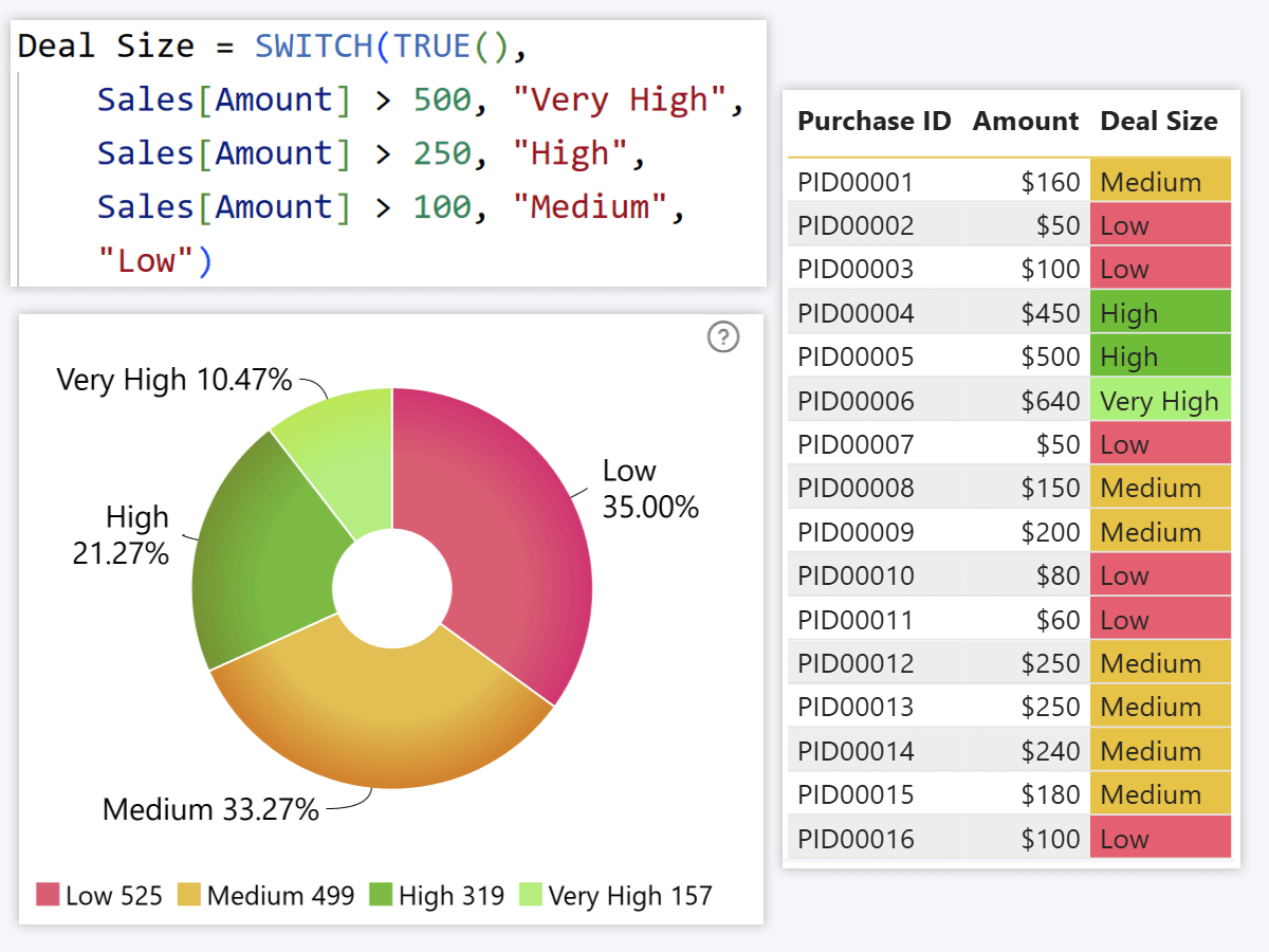
Use cases
- Bucketing (pricing tiers, risk groups, performance levels)
- Labels and tooltip fields with more than two options
- Conditional formatting based on numeric or text values
RANKX: Rank Items by Value
Assign a rank number to each row based on a measure
Ranking
RANKX([column], [expression])
What it does
RANKX assigns a rank to each row based on the value of a given measure, starting from 1 for the largest value. Useful for leaderboards, custom sort orders, and top-N filtering.
Example
You want to know which countries have the most total sales. RANKX assigns a rank per country based on Sales[Total Sales], letting you sort to see a leaderboard of best-performing markets. You can also add the rank measure to a Combo PRO Series field for custom chart sorting.
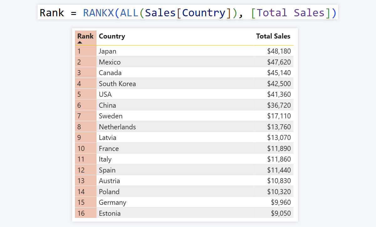
Use cases
- Leaderboards and rank display in tooltip fields
- Custom sort order for table rows and column charts
- Top-N or bottom-N filtering
From DAX Measures to Reports People Actually Use
These twelve essential DAX formulas are the foundation of every meaningful Power BI report. With them you can filter by context, calculate across rows, handle missing data safely, and bucket values into categories users can act on.
But measures alone do not make a report people use. The next step is designing visuals that surface those measures in a way that earns adoption, where users explore by clicking rather than configuring and where insights are visible without requiring a new page for every question.
See these measures applied in real 4U Reports
4U Procurement Report
CALCULATE, DIVIDE, and SUM applied to maverick spend, budget variance, and delivery performance
4U Executive KPI Report
CALCULATE with polarity-aware variance logic across 10 KPIs and 34 markets
4U Reports: the full framework
The design principles that turn DAX measures into reports that earn adoption
With Drill Down Visuals by ZoomCharts you get seamless cross-filtering, multi-level drill-down, and full customization, so the measures you have just learned power reports that users actually open.
Frequently Asked Questions
What is the most important DAX formula in Power BI?
CALCULATE is widely considered the most important DAX formula in Power BI. It changes the filter context of any expression, which means almost every advanced measure (time intelligence, segment comparison, running totals) relies on it at some level. Understanding CALCULATE unlocks the full power of DAX.
What is the difference between SUM and SUMX in Power BI DAX?
SUM adds up all values in a single existing column. SUMX evaluates an expression row by row across a table and then sums the results, which means it can calculate values that do not exist as a column yet, such as multiplying quantity by unit price before summing. Use SUM for simple column totals and SUMX when you need to calculate something per row first.
What is DAX in Power BI?
DAX (Data Analysis Expressions) is the formula language used to perform calculations and transform data in Power BI. Think of it as Excel formulas but more powerful, operating across entire tables and responding dynamically to filters and slicers in your report.
What is the difference between DAX measures and calculated columns?
Measures return values on-demand when a visual requests them and respond to the current filter context. Calculated columns exist as permanent parts of the table and are evaluated on report load row by row. Use measures for aggregations and KPIs, use calculated columns for row-level labels or categories.
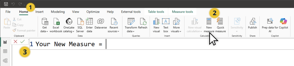
How do I create a DAX measure in Power BI?
Click the New Measure button in the Home tab of Power BI Desktop's top ribbon, or right-click in the Data pane and select New Measure. A formula bar opens where you enter your DAX expression. For a calculated column instead, select New Column from the same menu.
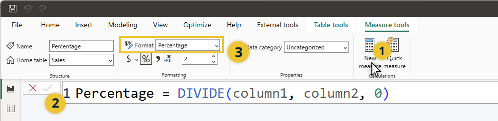
How do I calculate a percentage in Power BI with DAX?
Use DIVIDE: provide the first value as numerator and the second as denominator. The result is a decimal (e.g. 150 / 200 = 0.75). In the Format section of the top ribbon, set the format to Percentage and 0.75 becomes 75%. Always use DIVIDE instead of the "/" operator to avoid divide-by-zero errors.
Related Content